BioClub
BioClub -The origin of life-
- KV
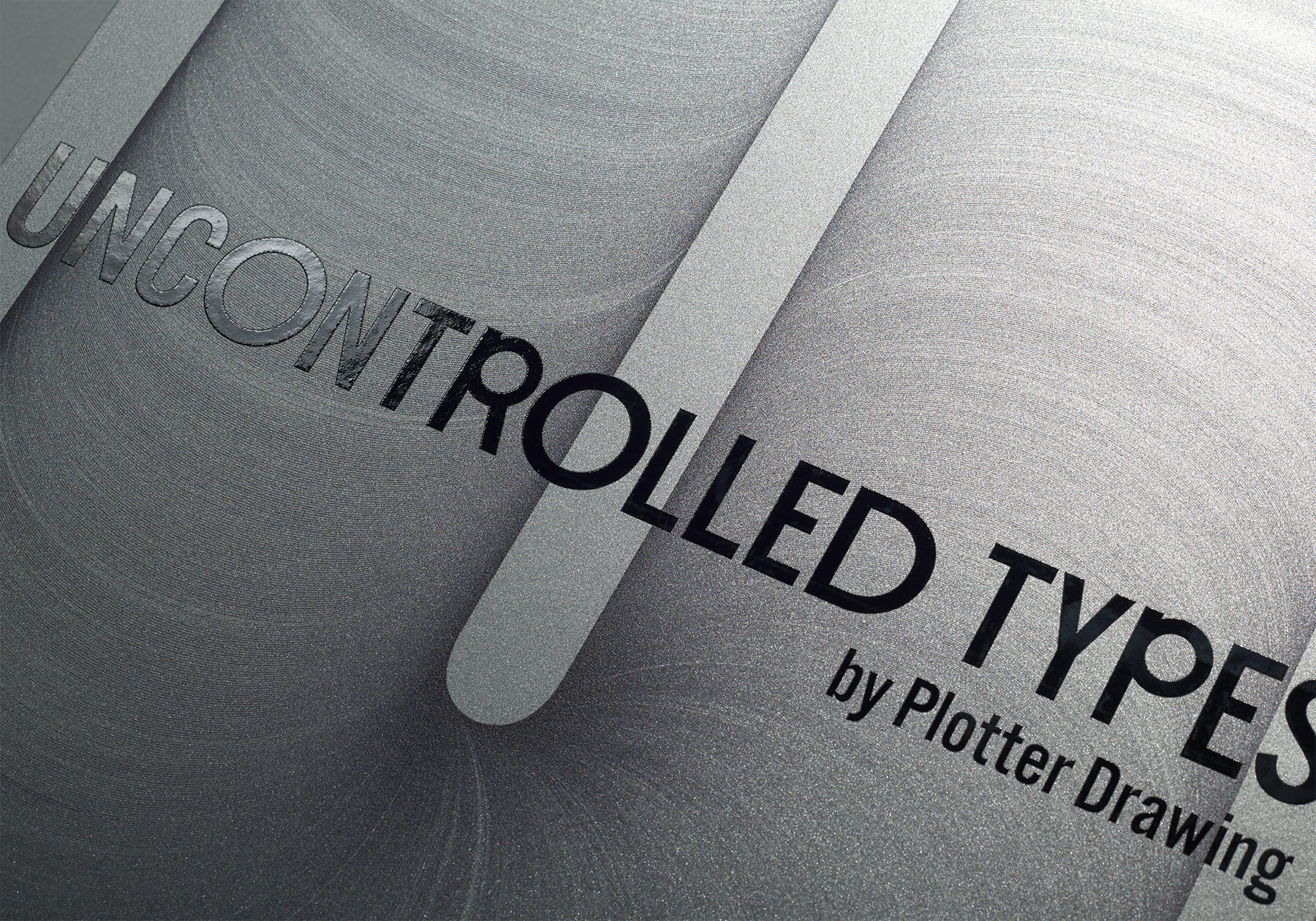
- Poster
- Typography
CONCEPT
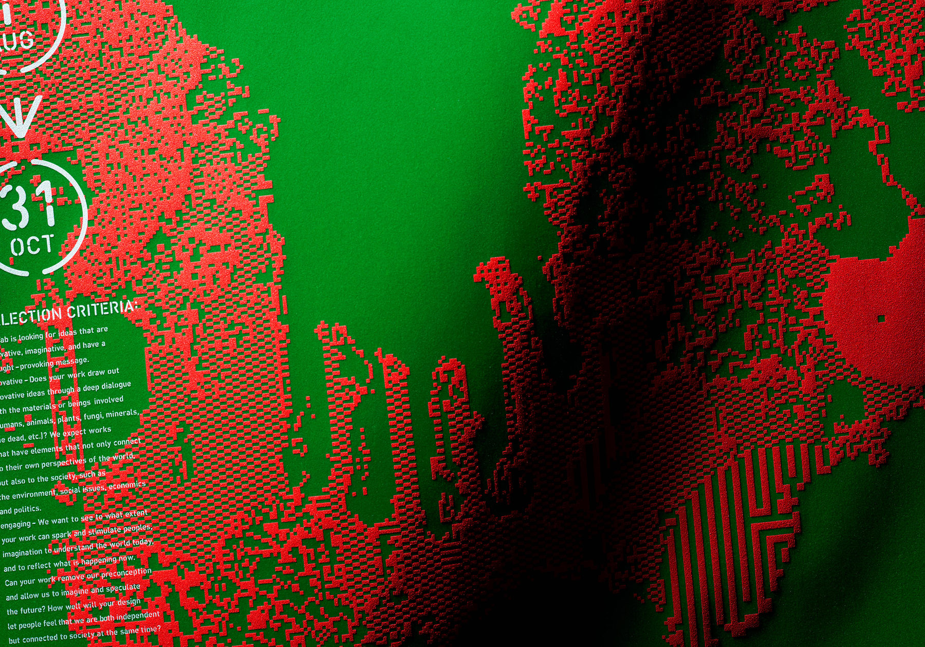
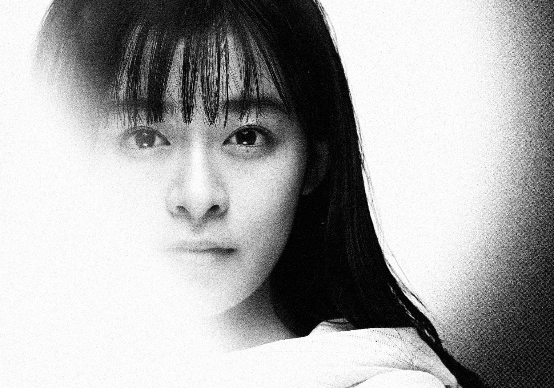
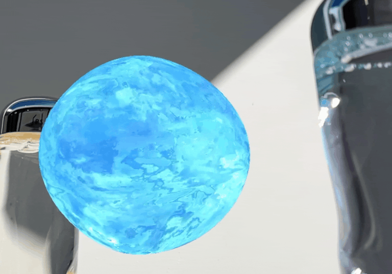
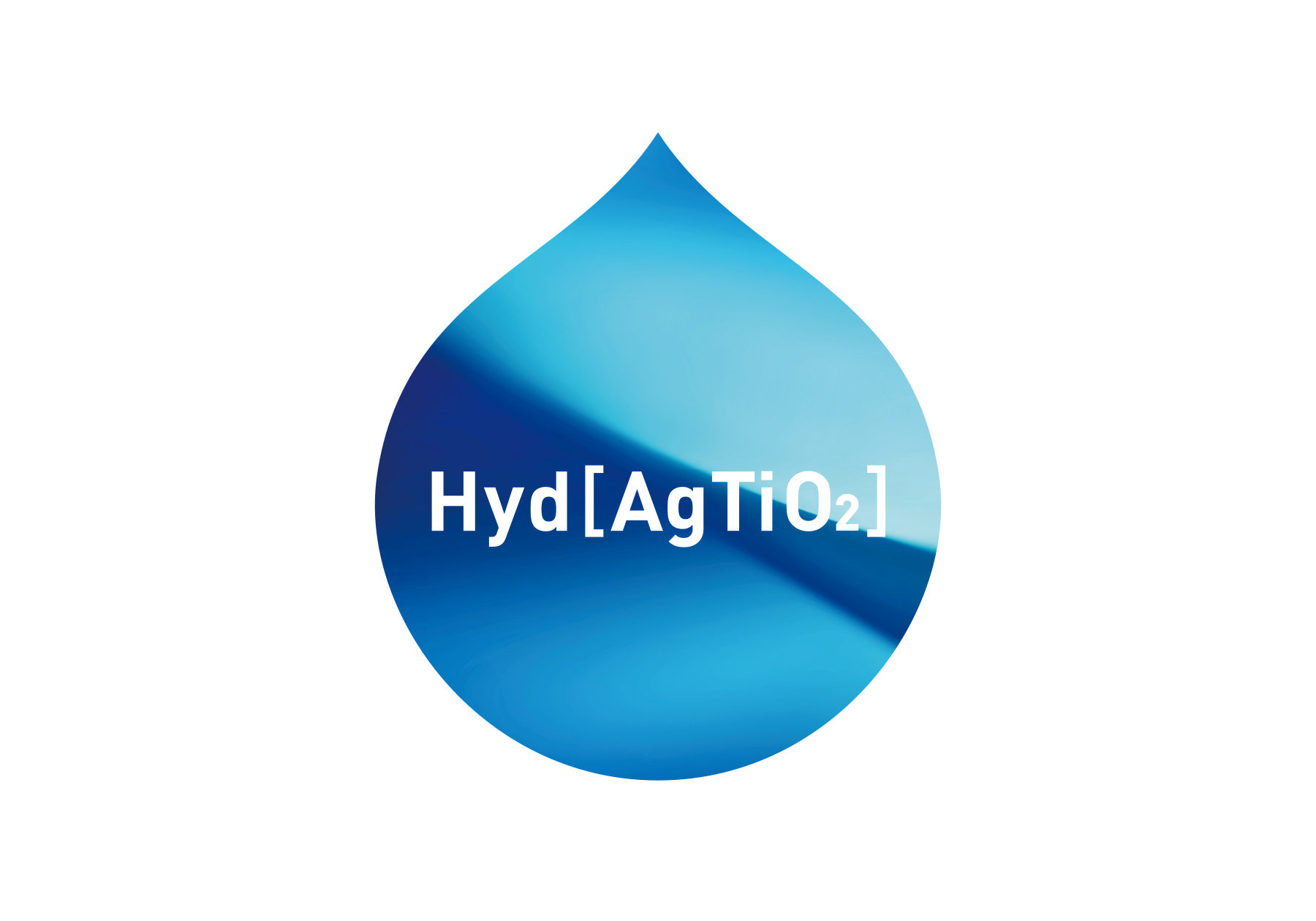
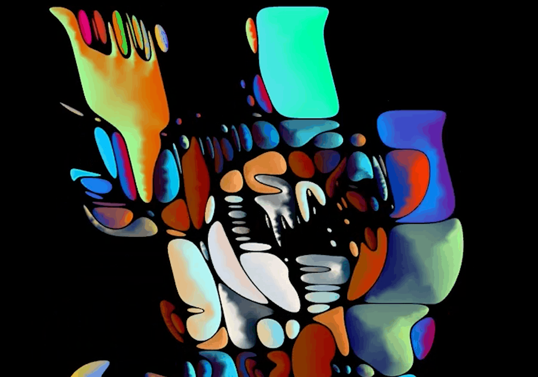
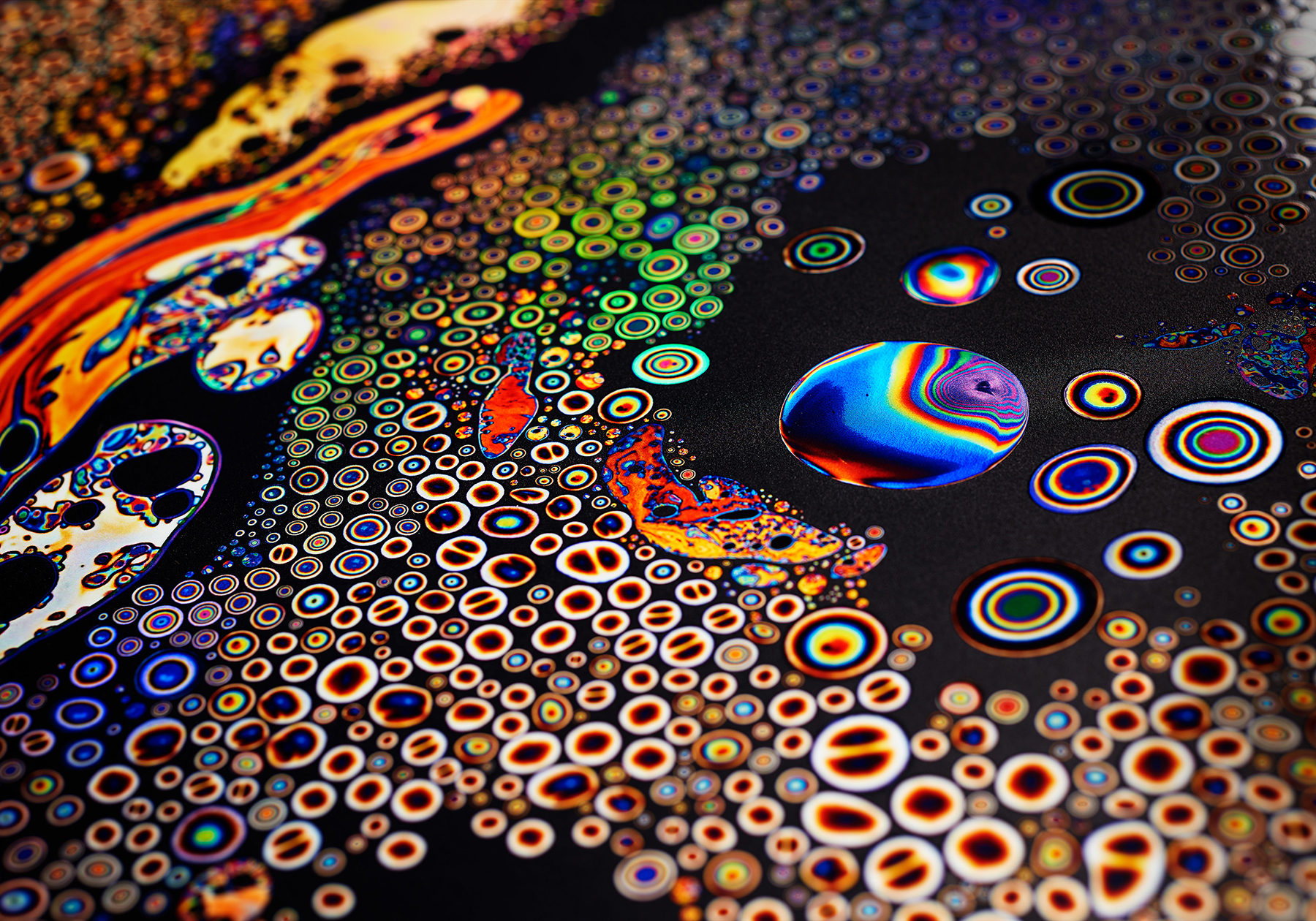
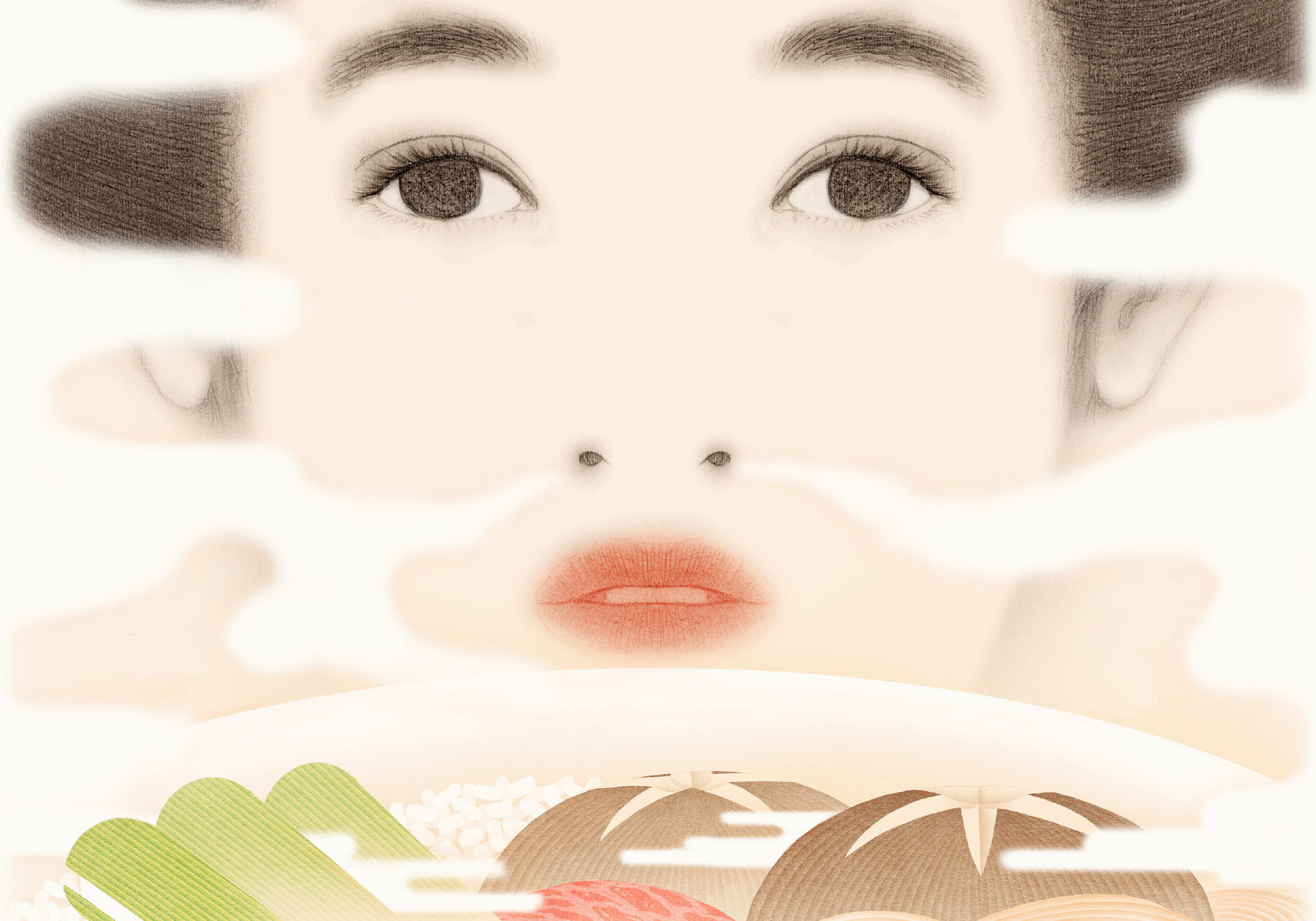
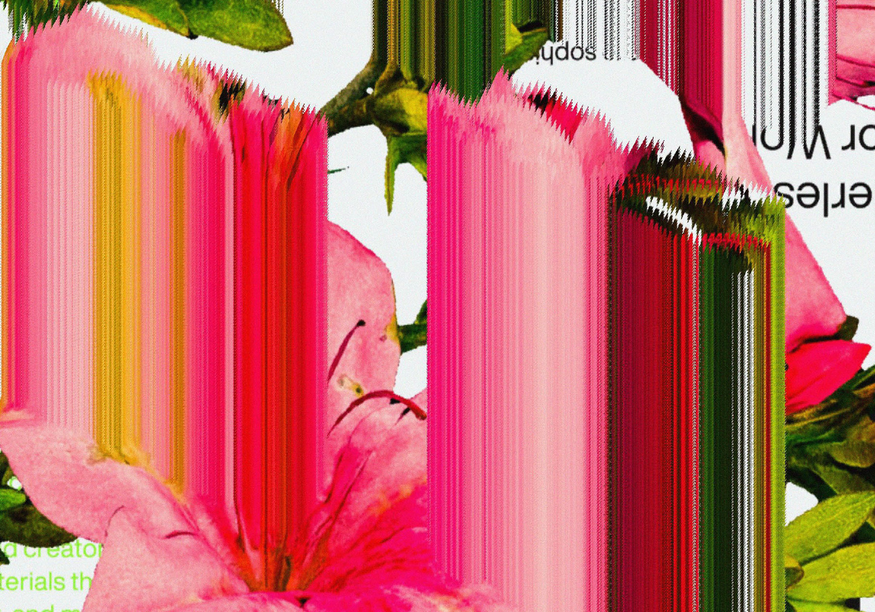
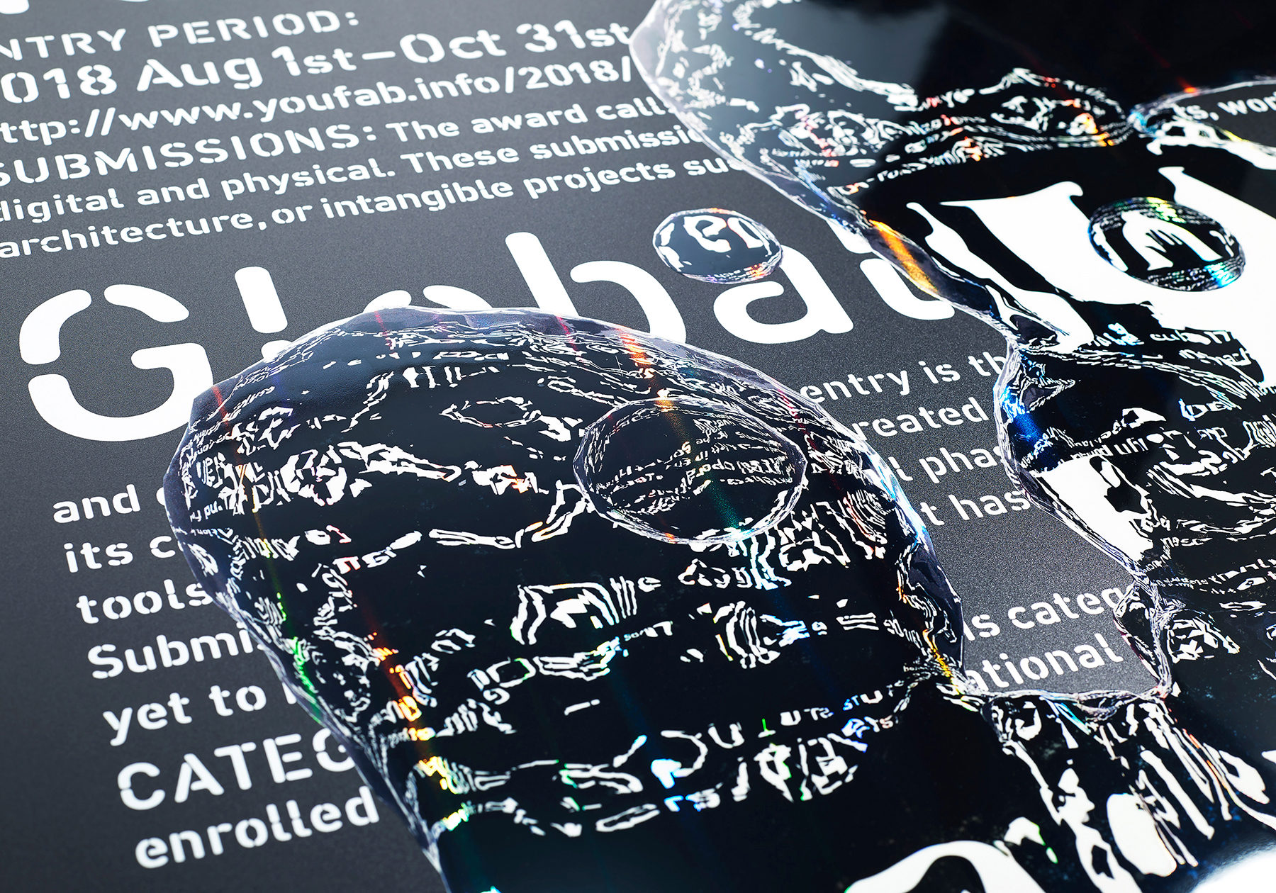
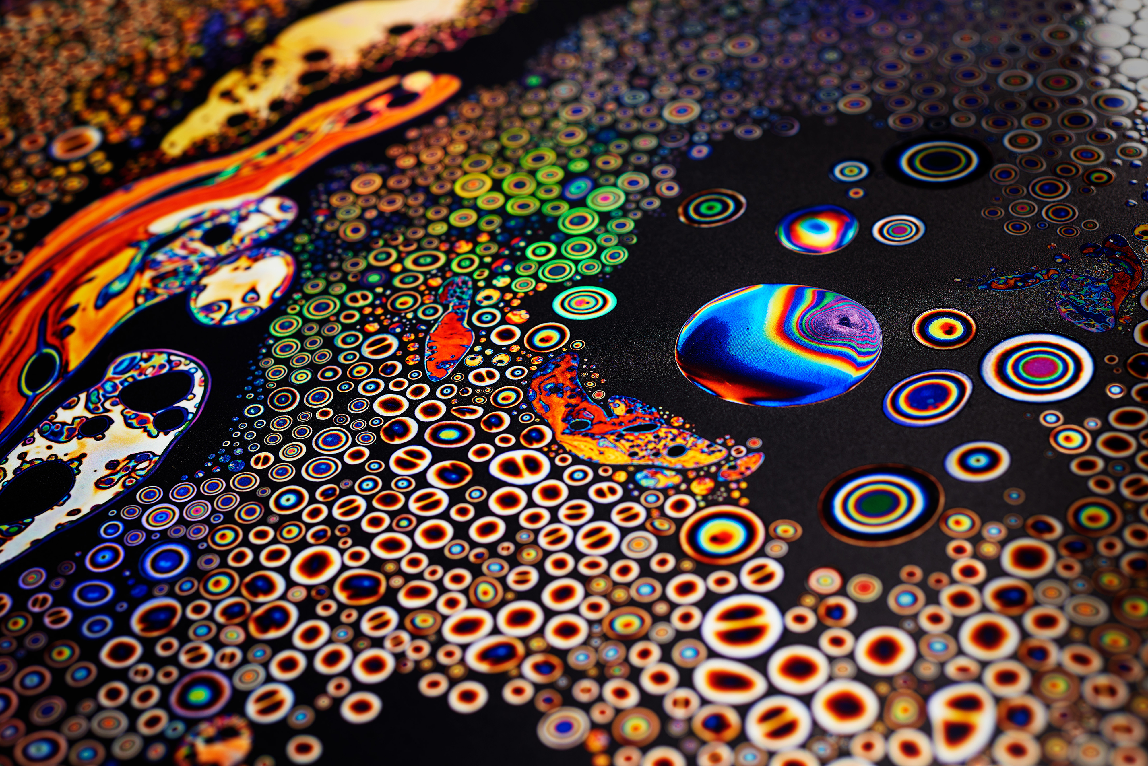
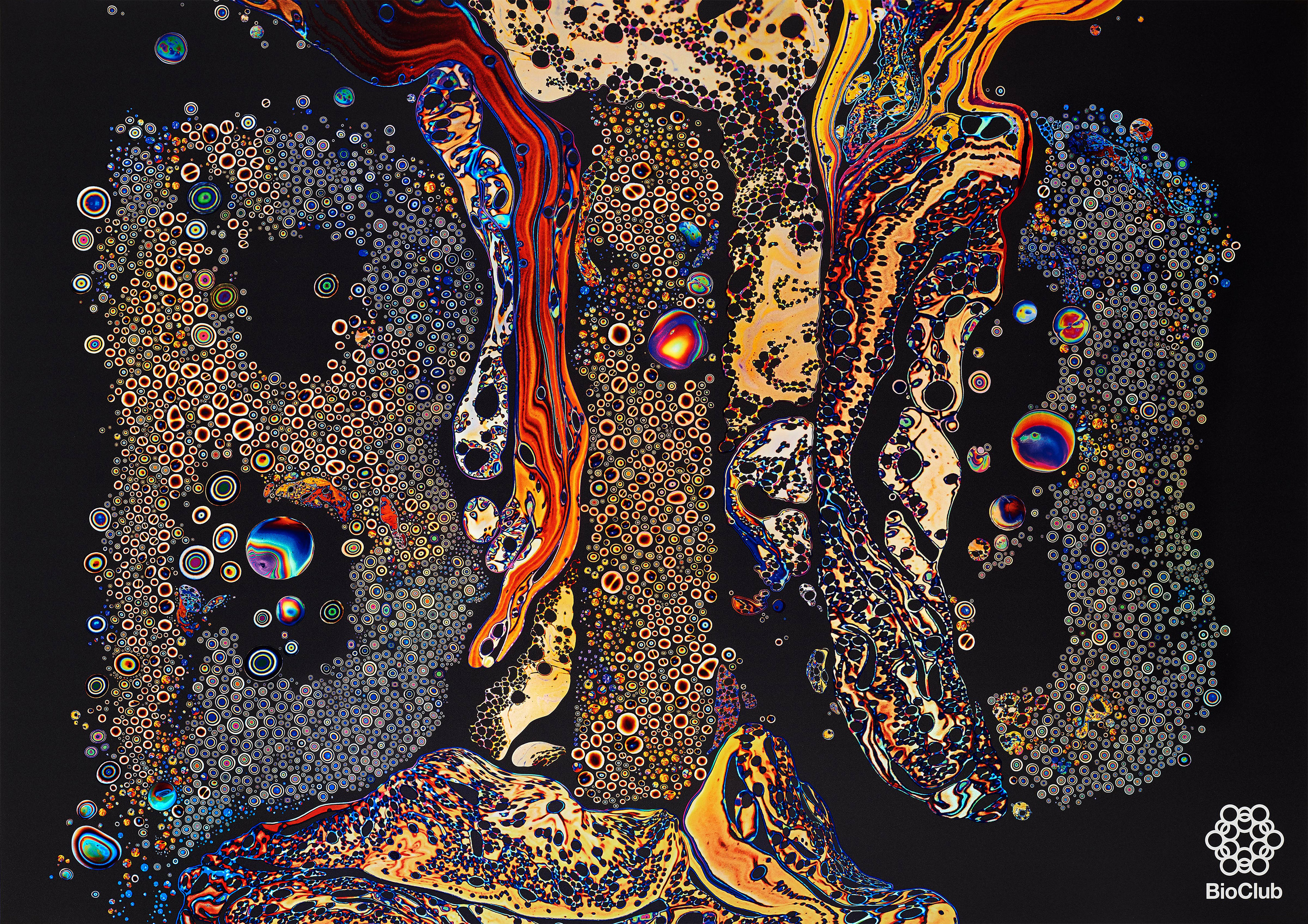
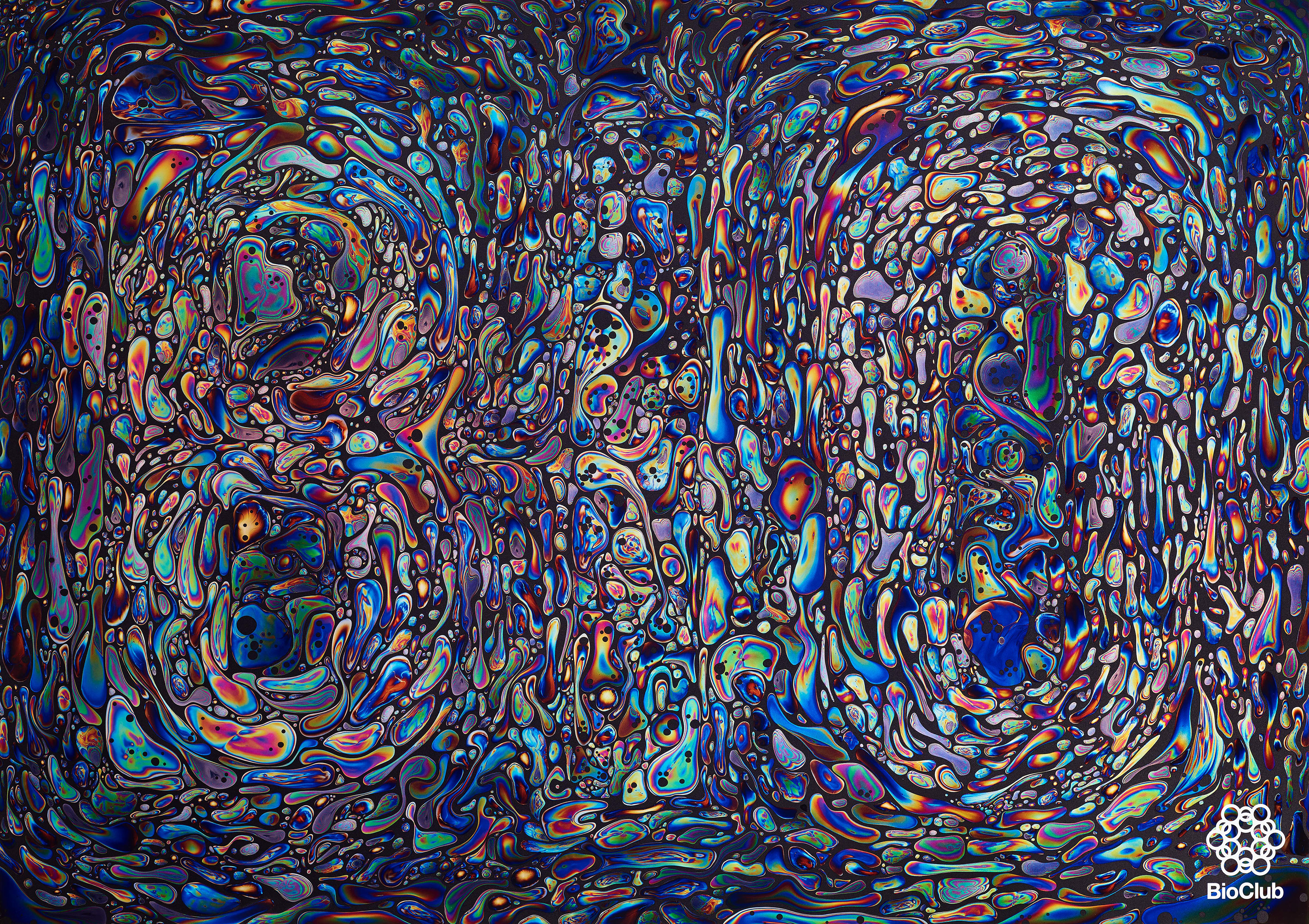
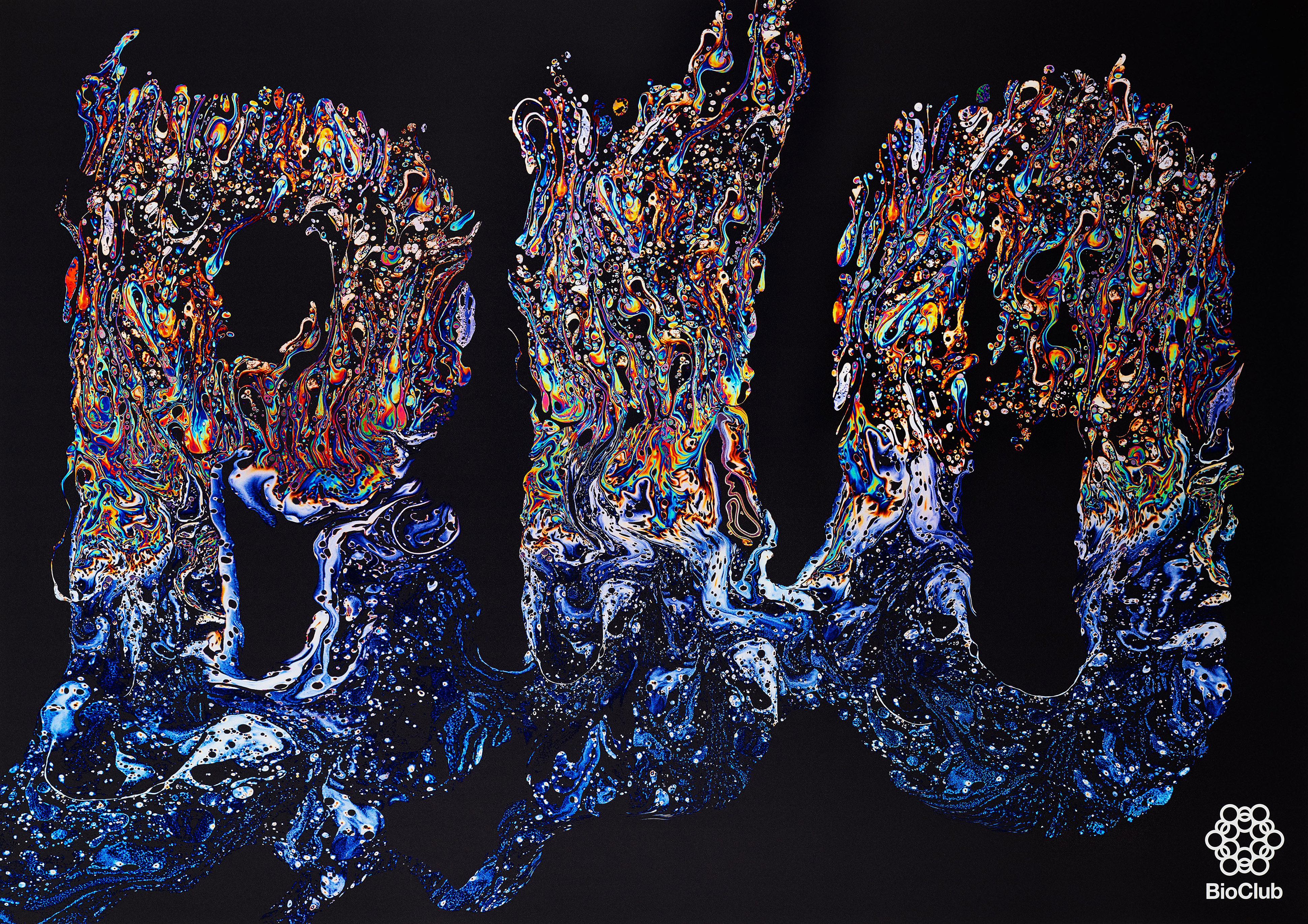
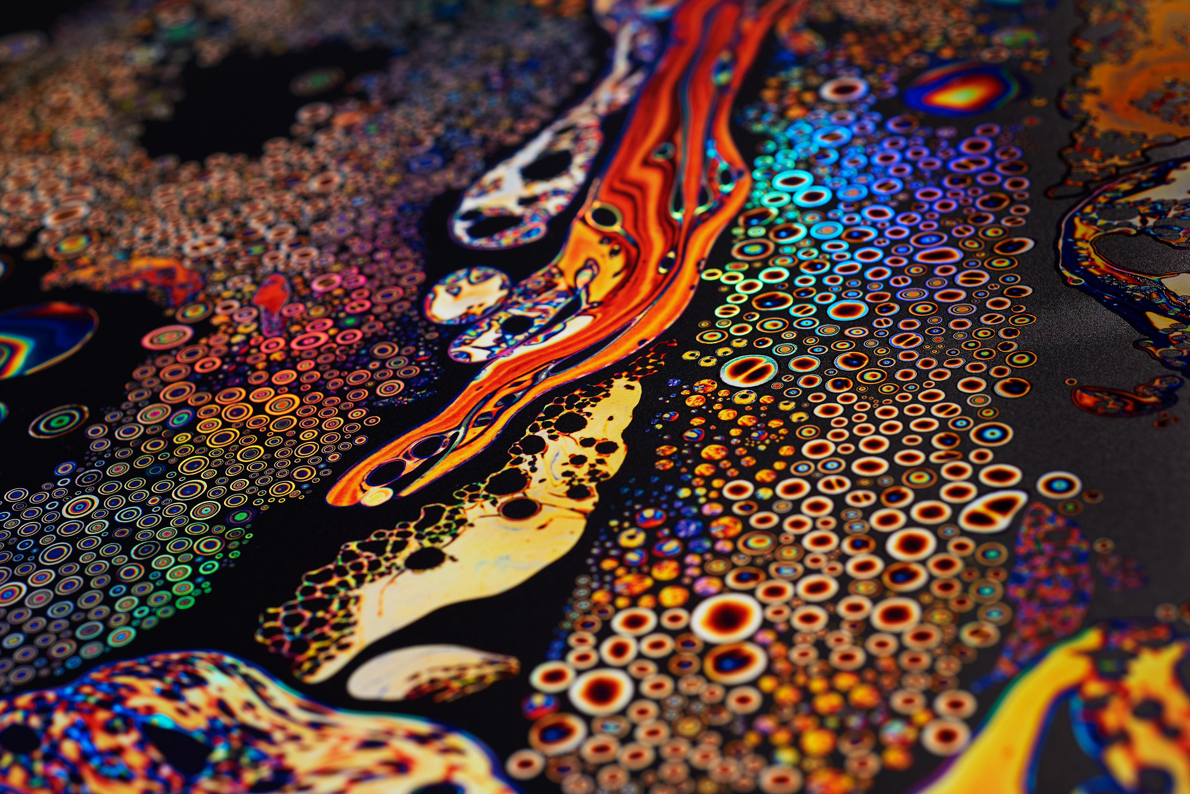
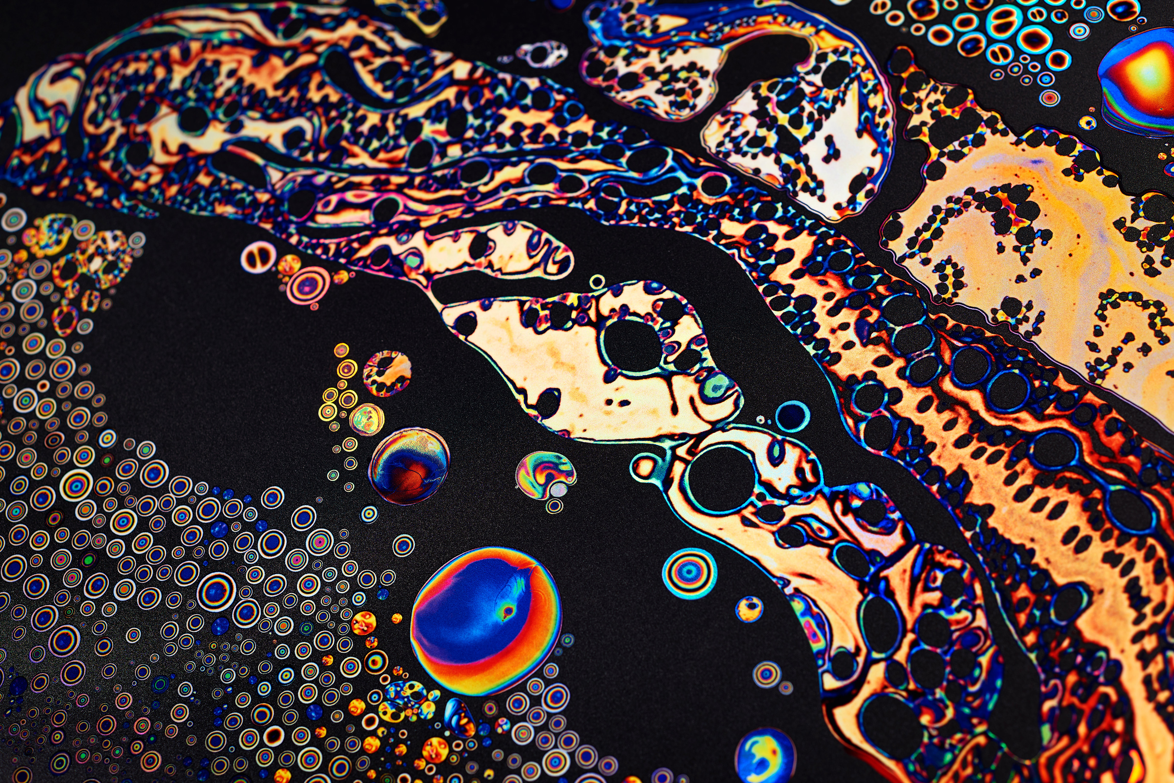
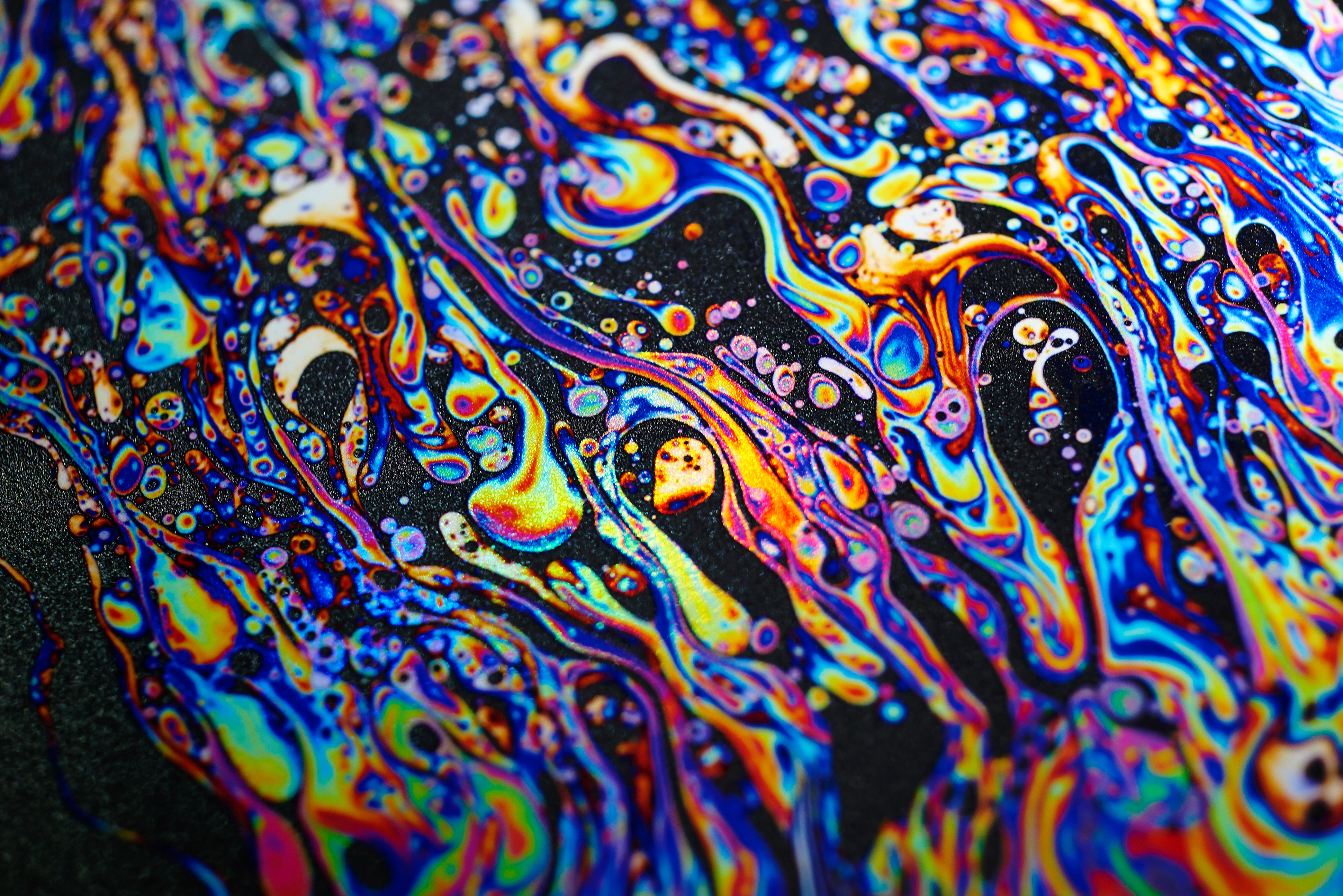
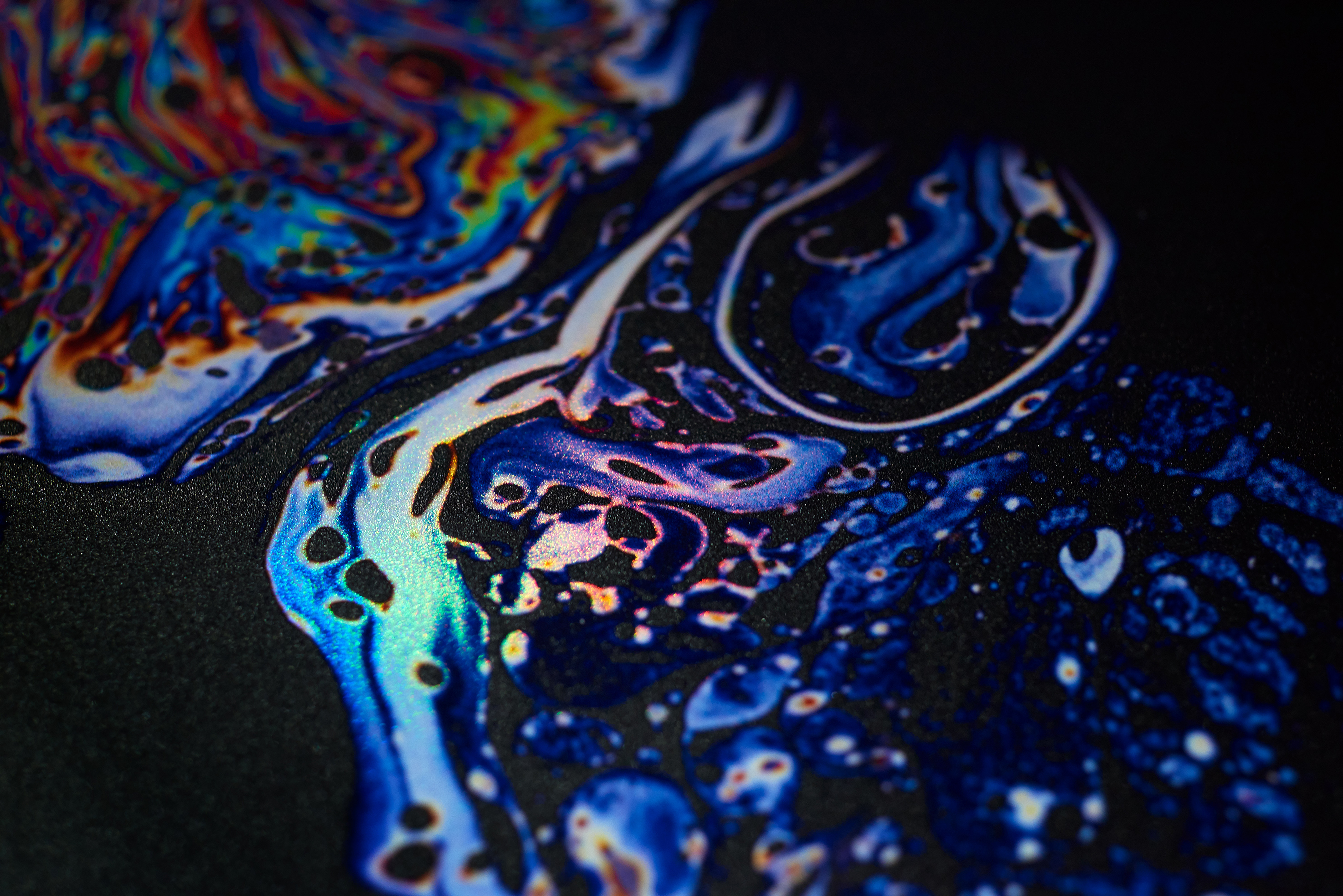
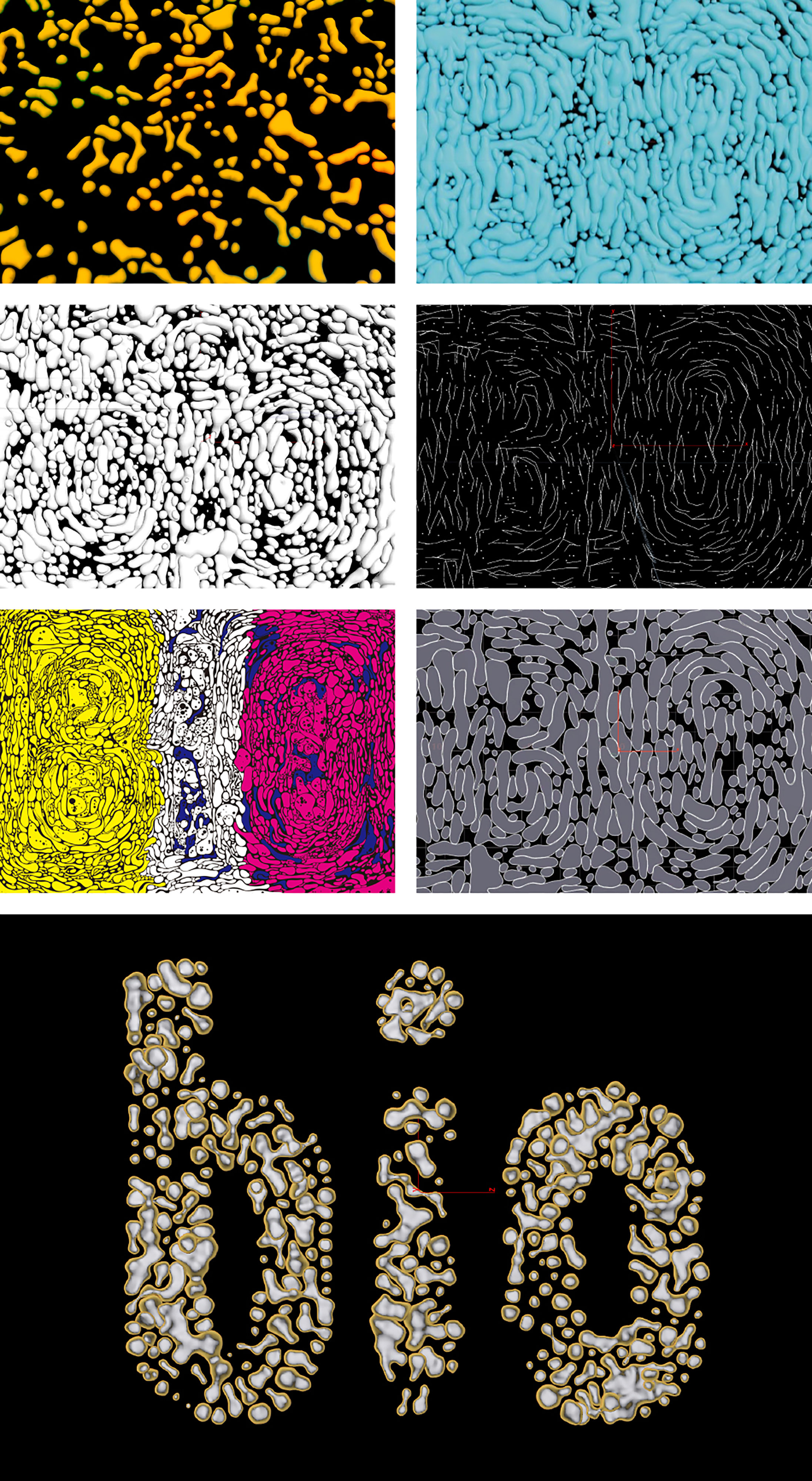
We designed the visual symbol for Bioclub, a platform for the formation of a biotechnology culture.
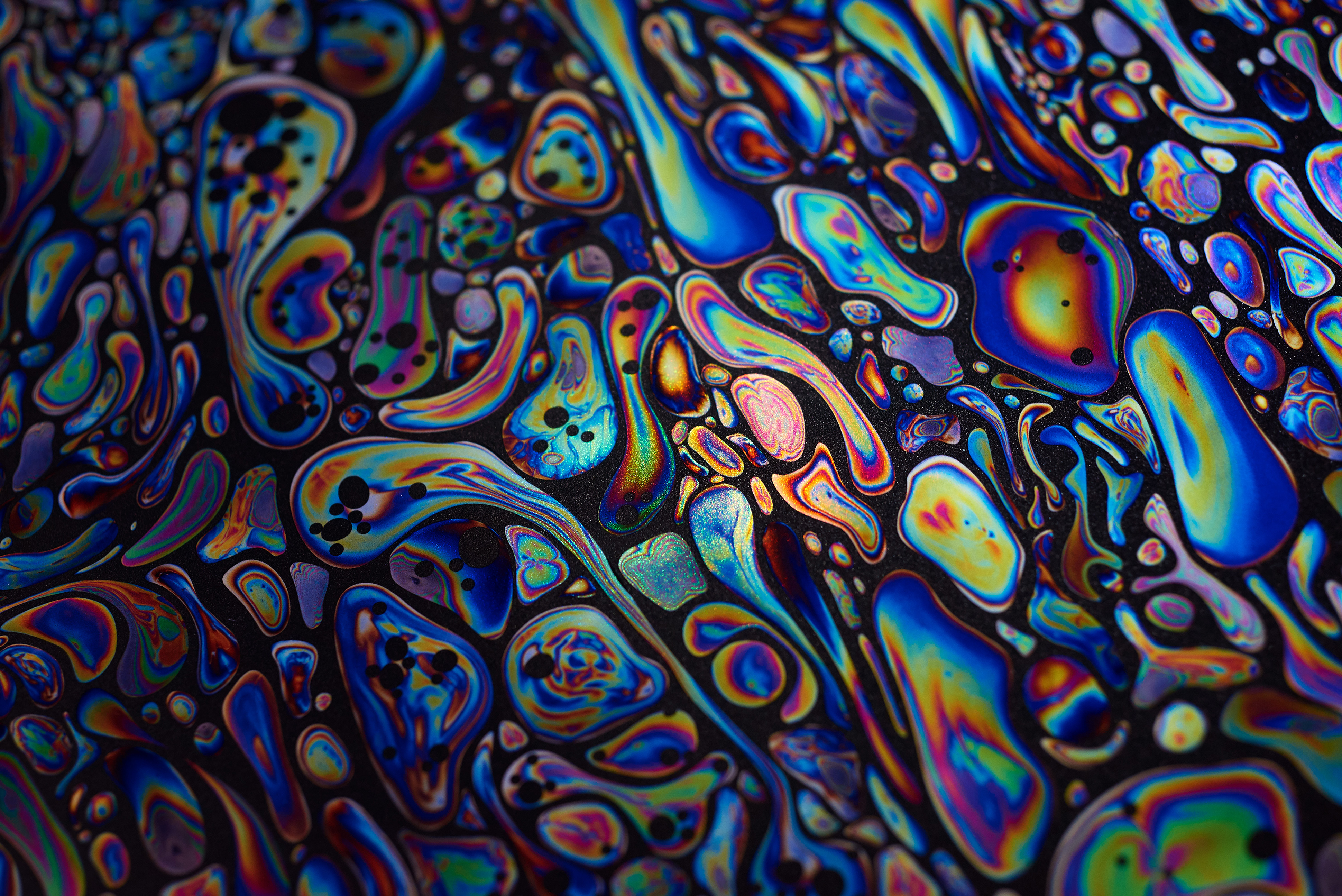
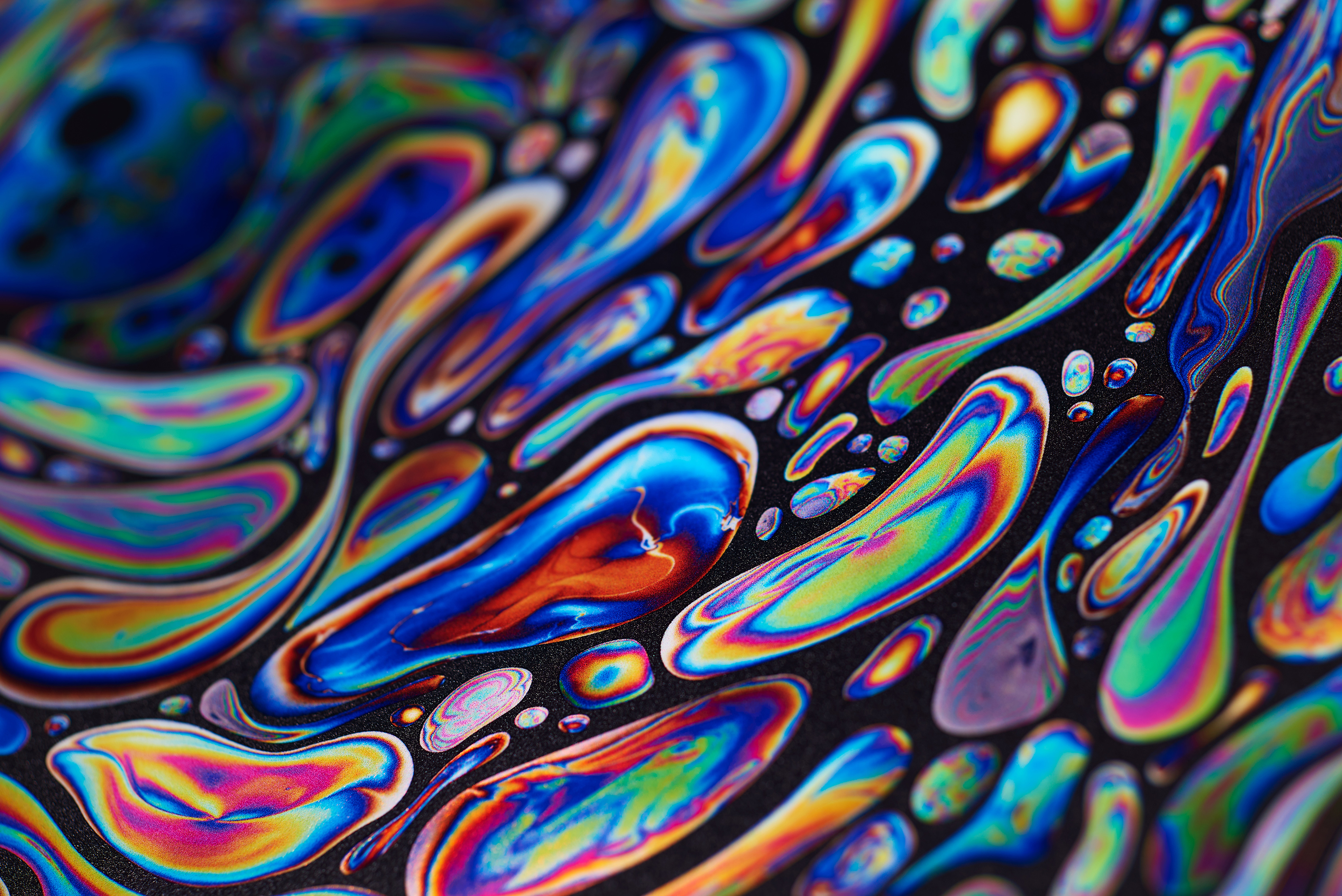
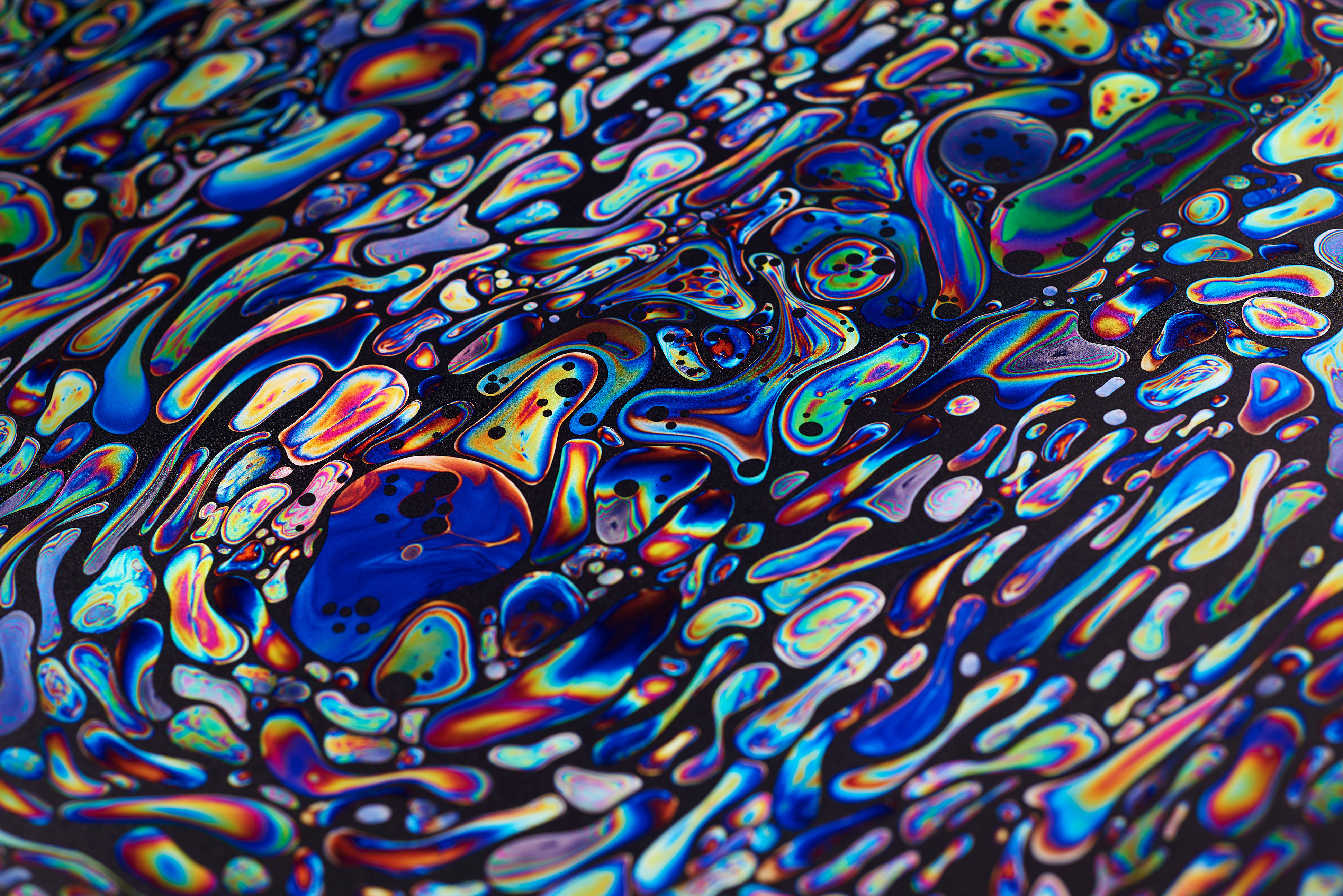
Visual design bearing a life-like structure born by the fusion of programming and graphic design.
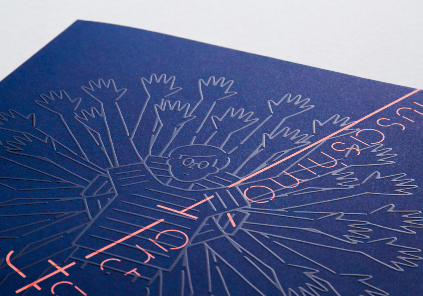
The three types of “BIO” typography are inspired by the fact that a protocell, the origin of life, has a simple lipid membrane structure.
バイオテクノロジーの文化を形成するプラットフォーム「Bioclub」がより広く認知されるためのシンボルとなるビジュアルを作成。プログラミングとグラフィックデザインの融合によって生み出される生命的な構造を持ったビジュアルデザイン。
3種類の「BIO」タイポグラフィーは生命の原初である細胞(プロトセル)が単純な油膜構造を持つことから着想を得た。
CREDIT
- Creative Directore
- Kazushige Takebayashi [SHA inc.]
- Art Directore
- Natsuki Isa [SHA inc.]
- Designer
- Natsuki Isa [SHA inc.]
- Shuhei Yokota [SHA inc.]
- Photo Editor
- Miki Kudo [The Elves and the Shoemaker.Co.,Ltd.]
- programmer
- Junichiro Horikawa [Orange Jellies]
- Shoya Dozono [Qosmo, Inc.]
- Ryosuke Nakajima [Qosmo, Inc.]
- Director
- Chiaki Ishizuka
- Printing Director
- Shunichi Yamashita [SHOEI Inc.]