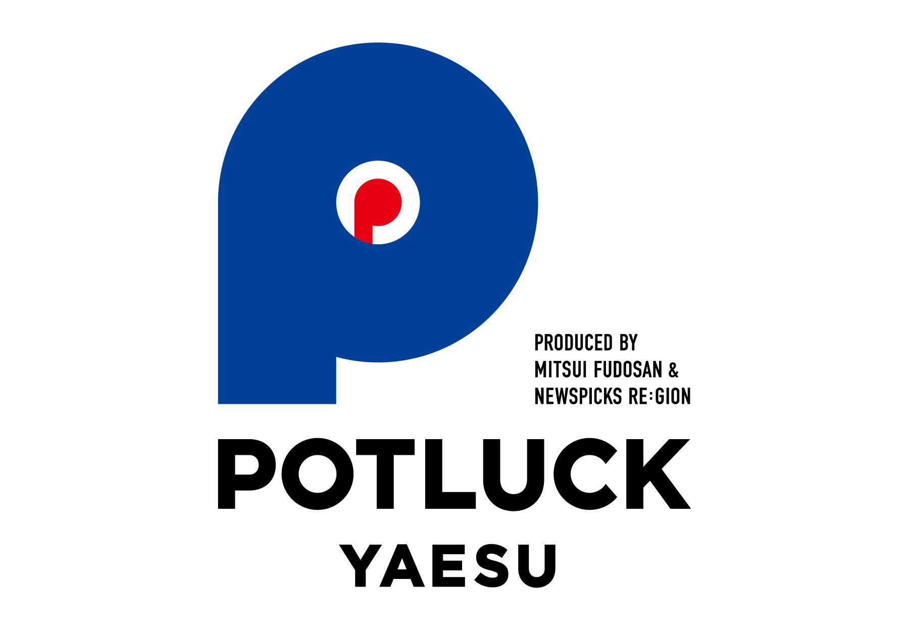
POTLUCK YAESU
- Branding
- Logo
- KV


CONCEPT
A four-region economic creation project opened in Tokyo Midtown Yaesu.
The word “potluck” is derived from the Native American
The word “potluck” is derived from the Native American custom of giving things as gifts to others, and means “to bring.
Here, something that is not a thing is brought from all over the country,
Dialogue with people you have not met yet, and
and exciting times are born, and they overlap.
Connecting the community with the community. It connects people with the community.
People and people are connected.
A place, people, and pride.
People gather and bring things together, transcending regional boundaries,
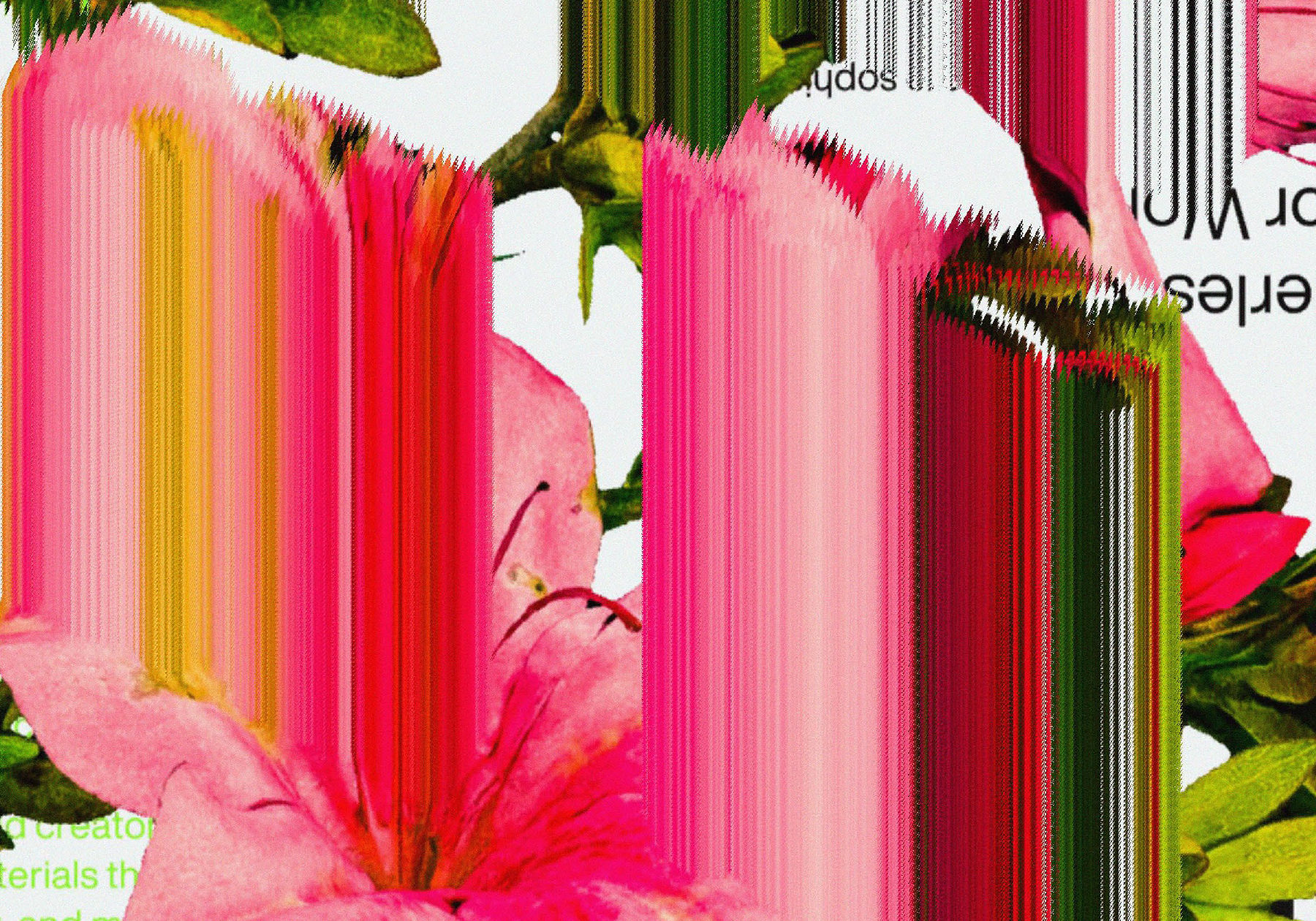
The blue color of the logo expresses the possibility of a dialogue between the community and the future.
The blue color of the logo represents the potential of all regions and
and the place where they gather at POTLUCK YAESU.
The red color represents the people who gather here
and their pride and will.
東京ミッドタウン八重洲にオープンした4地域経済創発プロジェクト。
ポットラックとは、アメリカ先住民の
相手にモノを贈る風習が語源で、「持ち寄る」の意。
ここは全国各地からモノではない何かが持ち寄られ、
まだ出会えていなかった人との対話や
ワクワクした時間が生まれ、重なってゆく場所。
地域と地域がつながる。地域と人がつながる。
人と人がつながる。
場と人と、そして誇り。
人が集まり持ち寄ることで、地域の垣根をこえて、
開かれた未来への対話が生まれていくことを表現した。
ロゴの青色が表すのは、可能性を秘めたあらゆる地域と
それらが集まるPOTLUCK YAESUの場。
そして赤色は、この場所に集まる人々
そしてその誇り・意思を表している。
CREDIT
- Art Director
- Kazushige Takebayashi [SHA inc.]
- Kyosuke Tsukimori [NewsPicks.inc.]
- Designer
- Norito Ishihara [SHA inc.]
- Koki Watanabe [SHA inc.]
- Producer
- Yuki Yamamoto [NewsPicks.inc.]