SIDEKICK
- Logo
- Package
CONCEPT
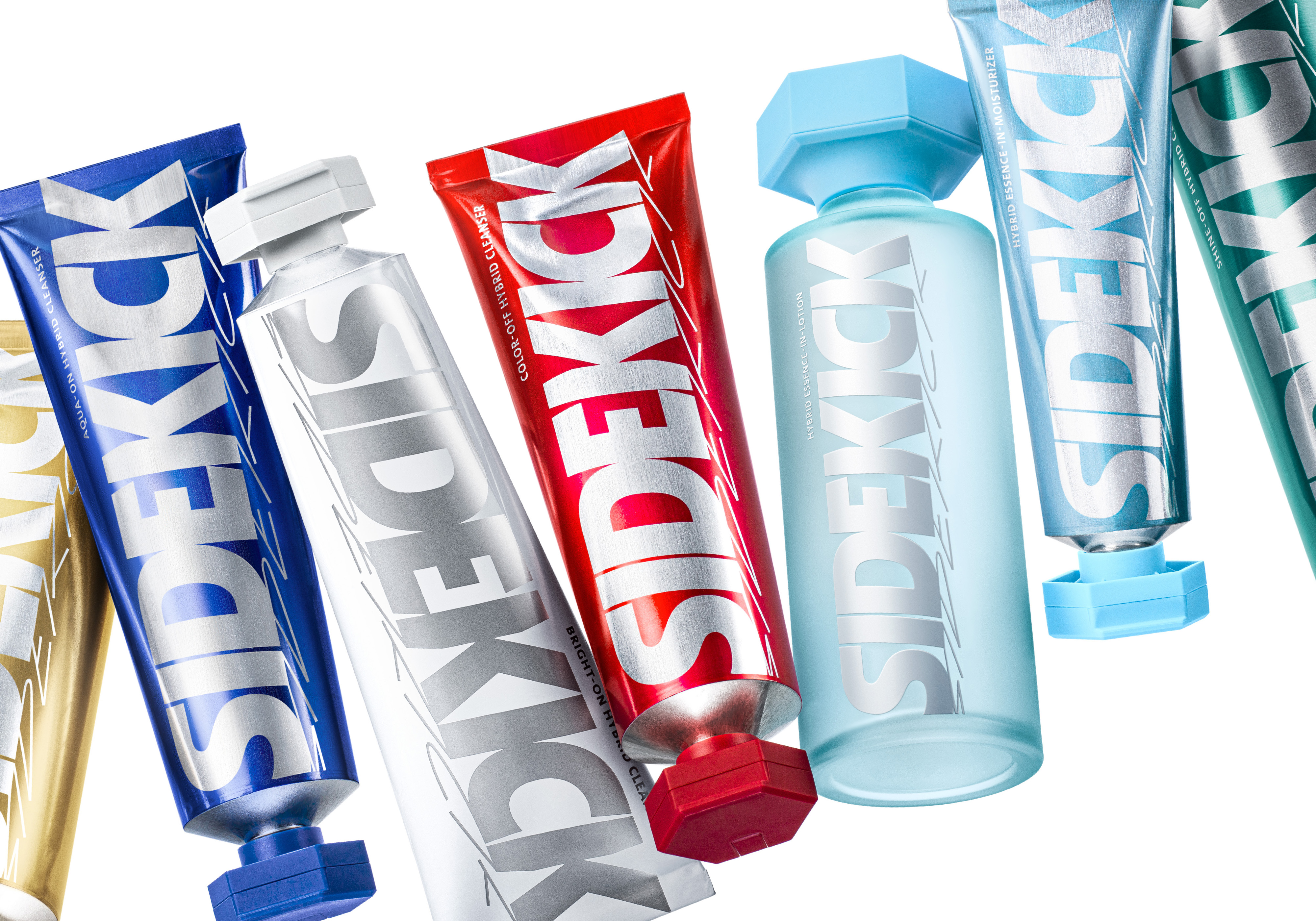
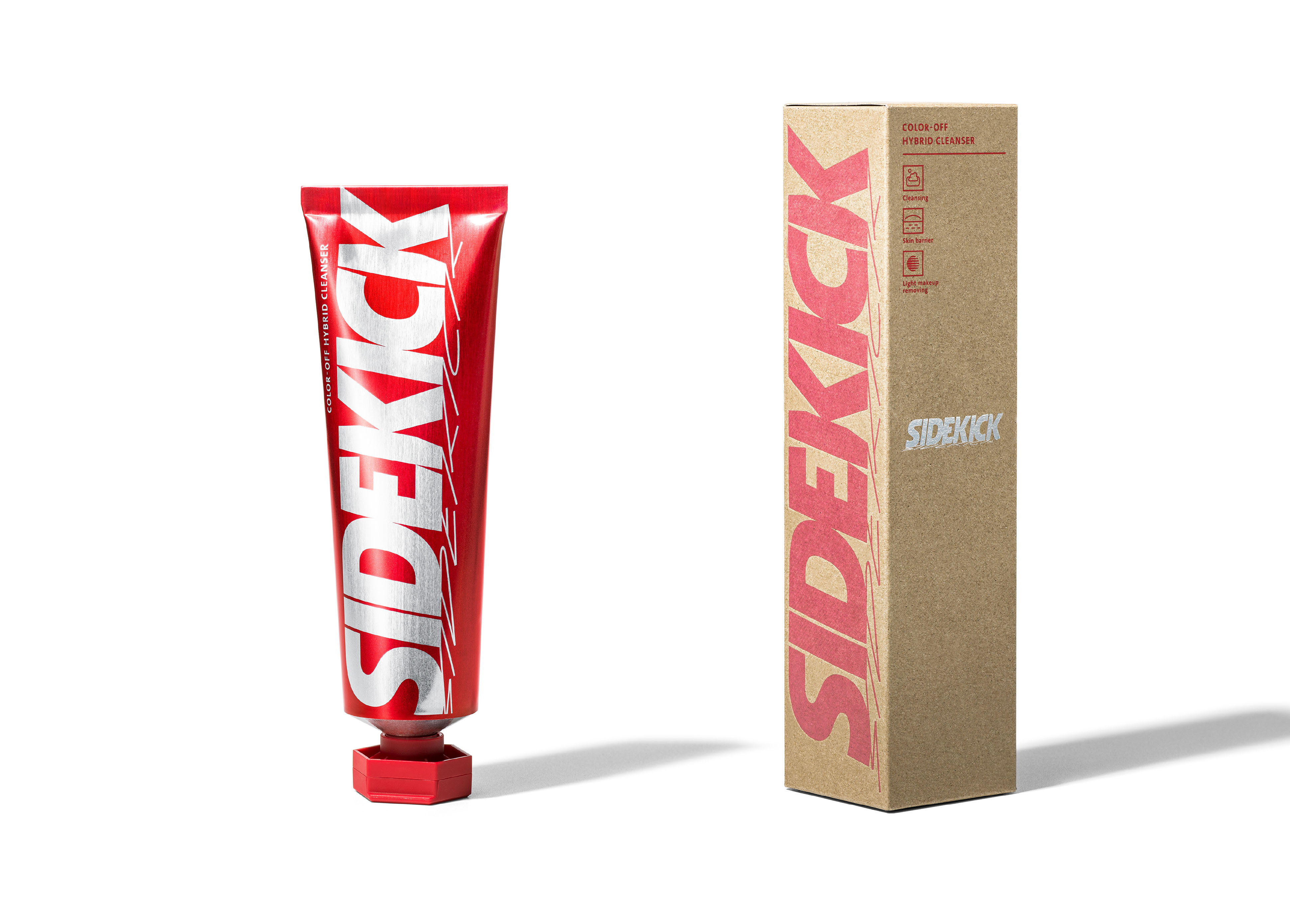
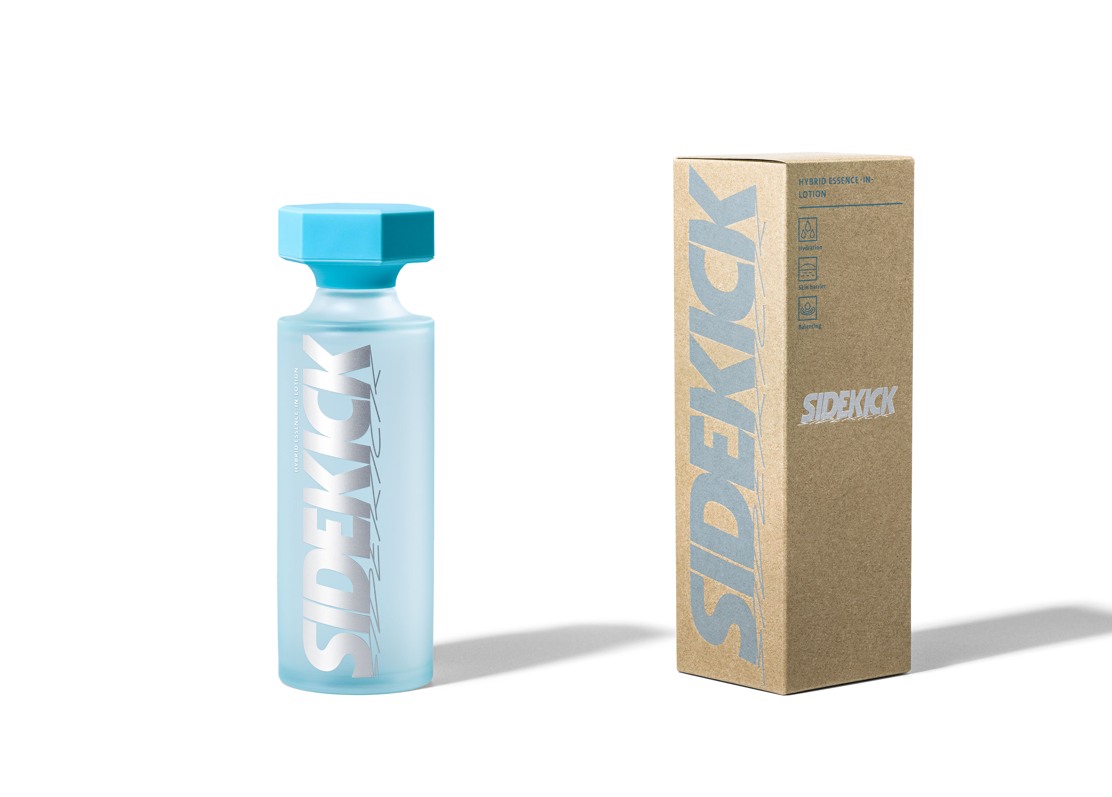
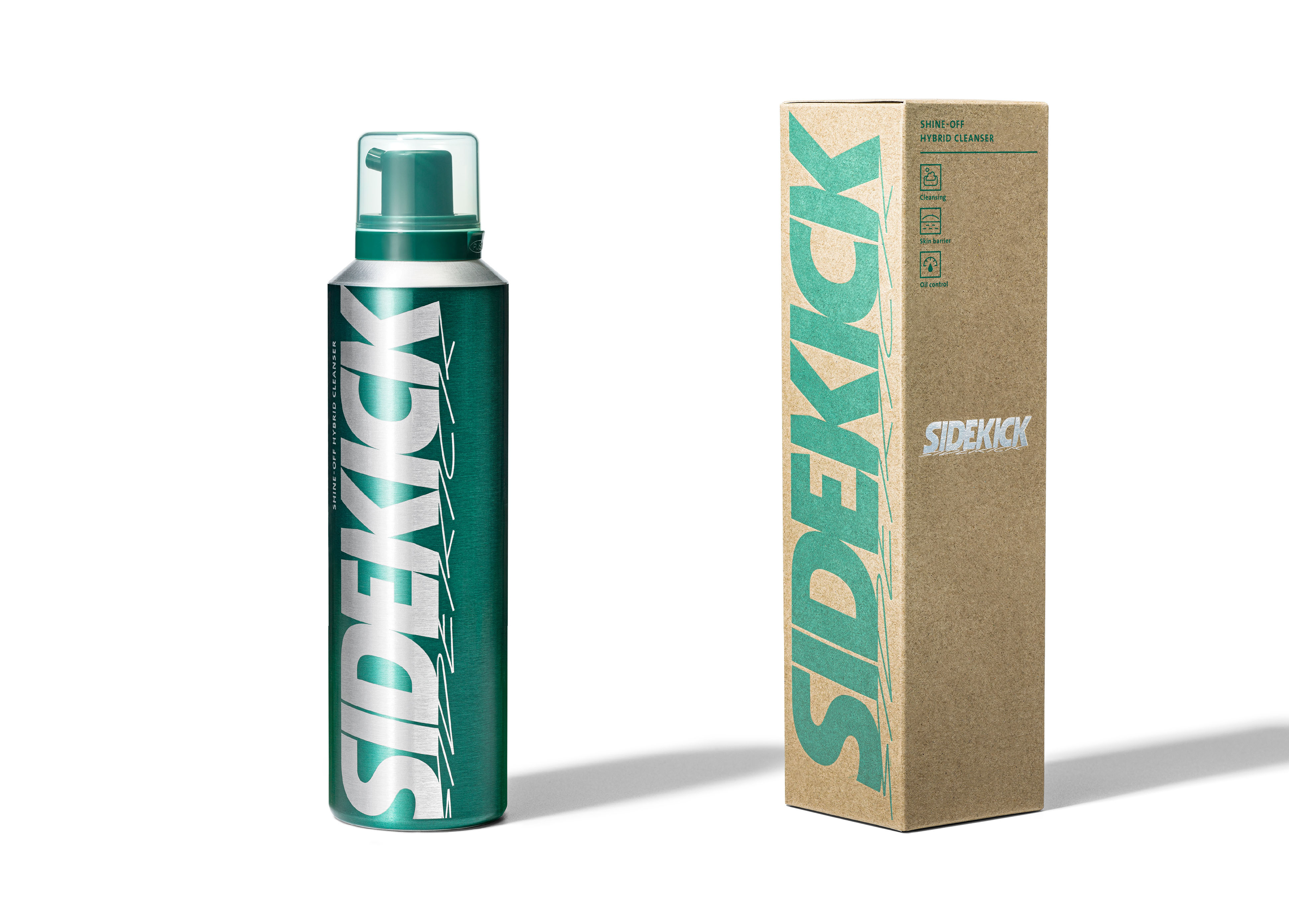
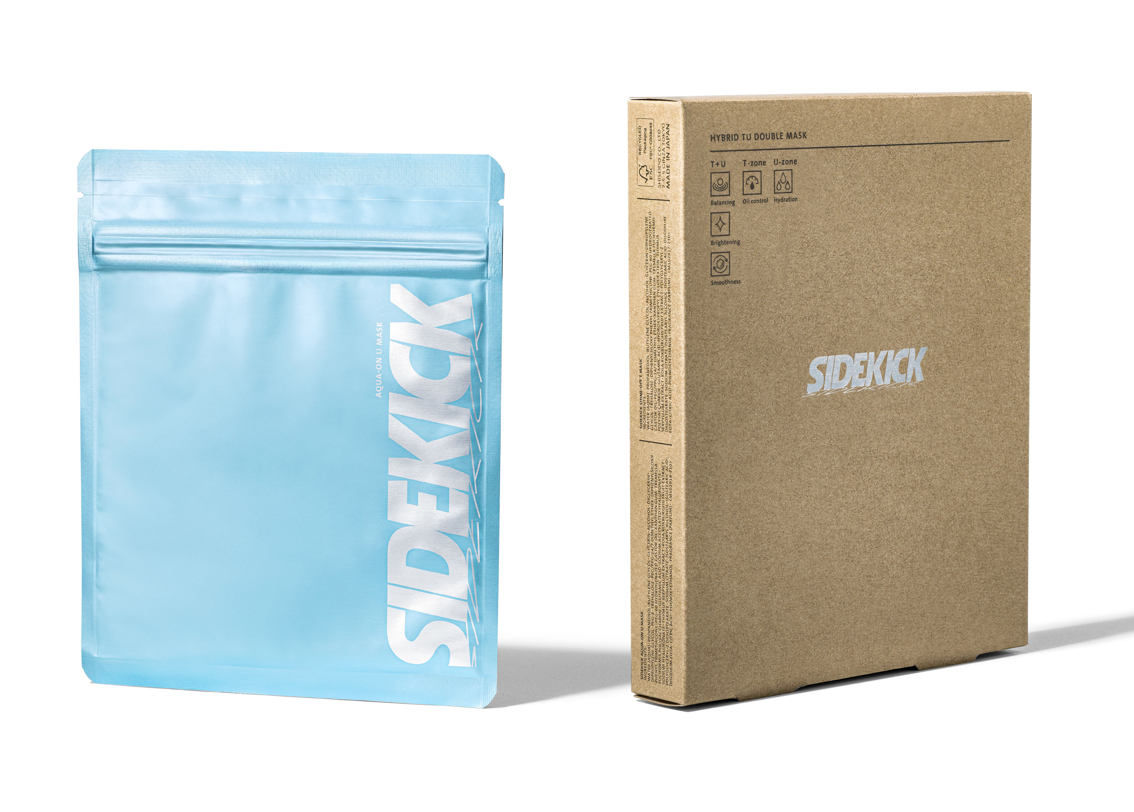
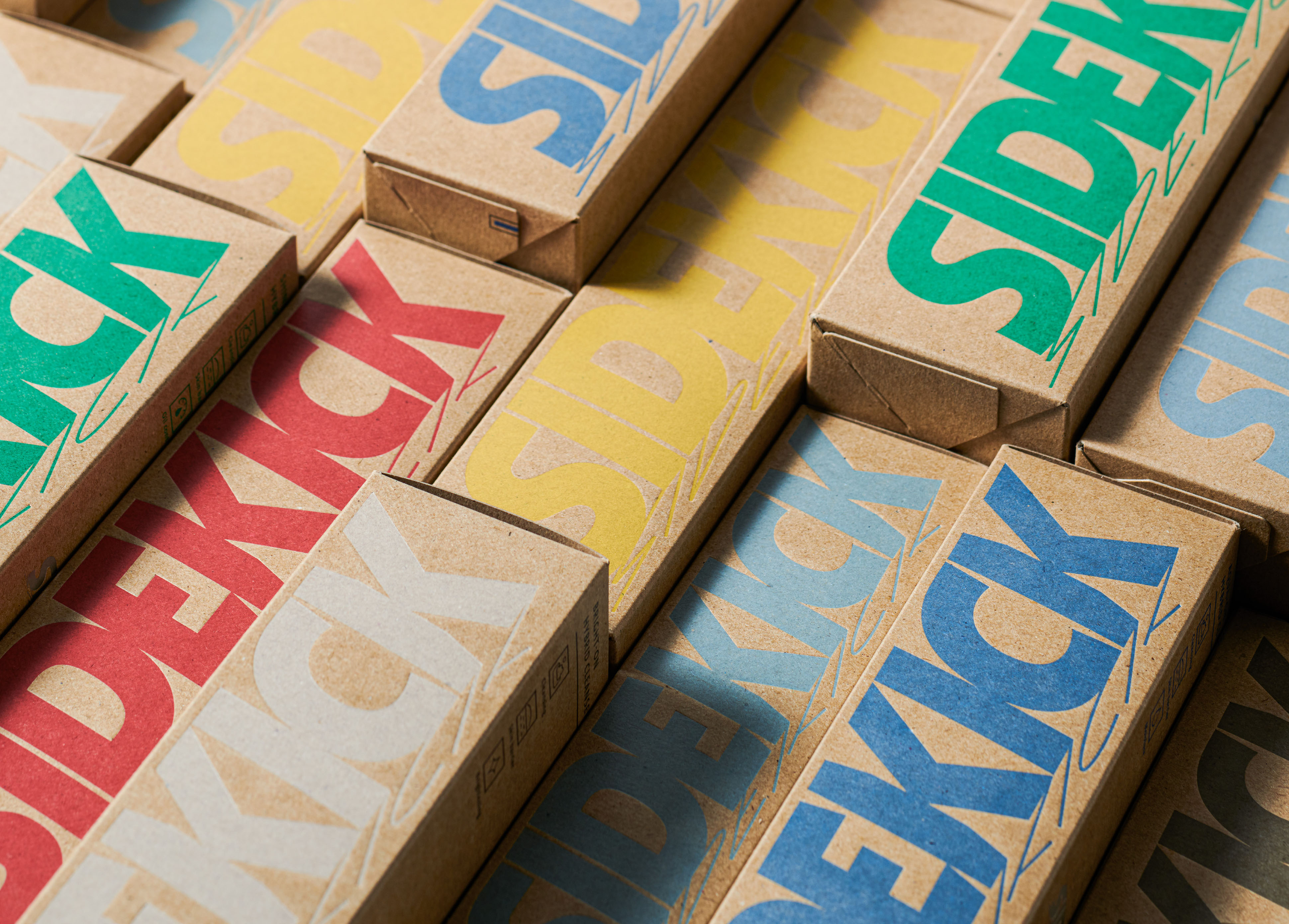
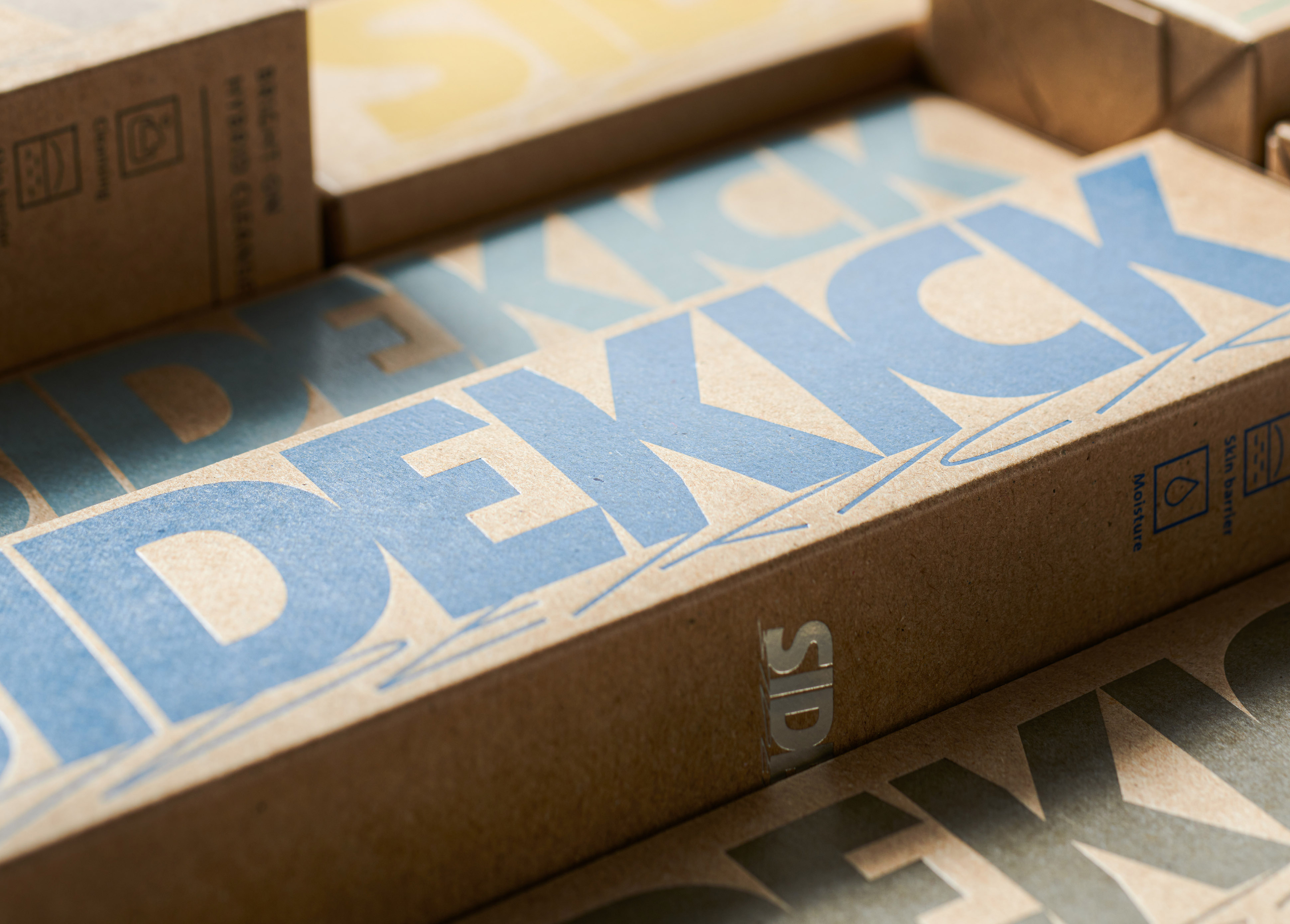
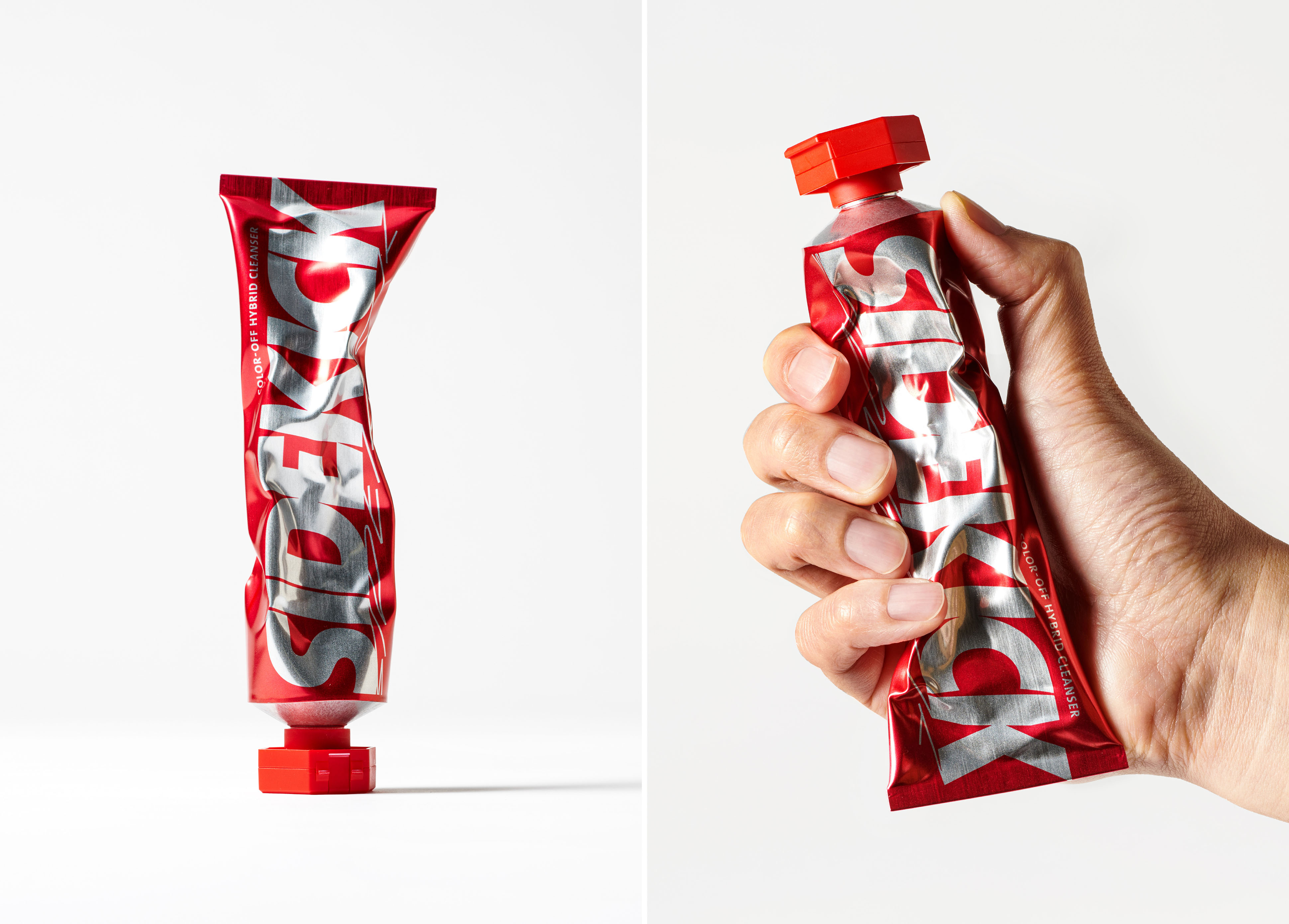
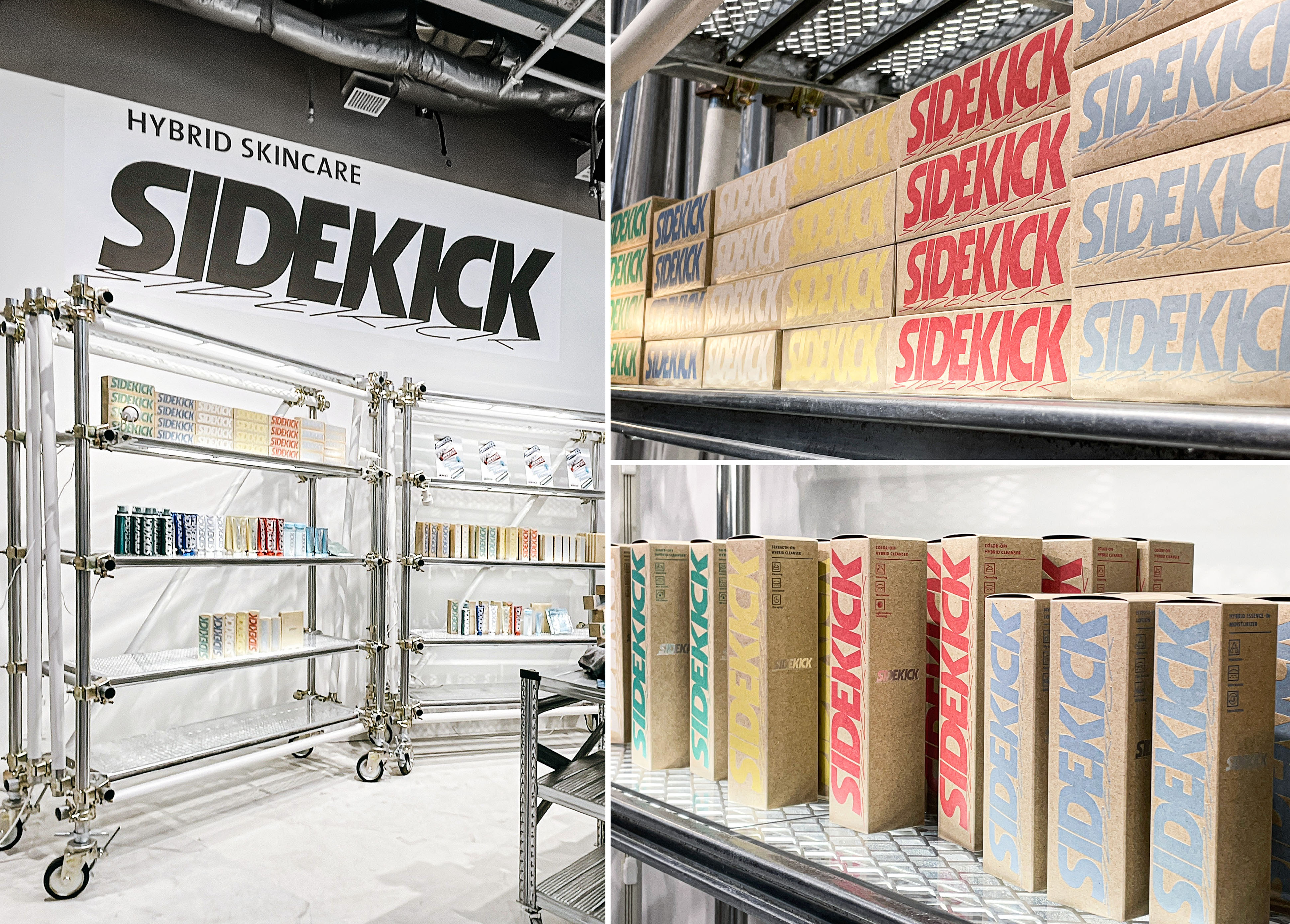
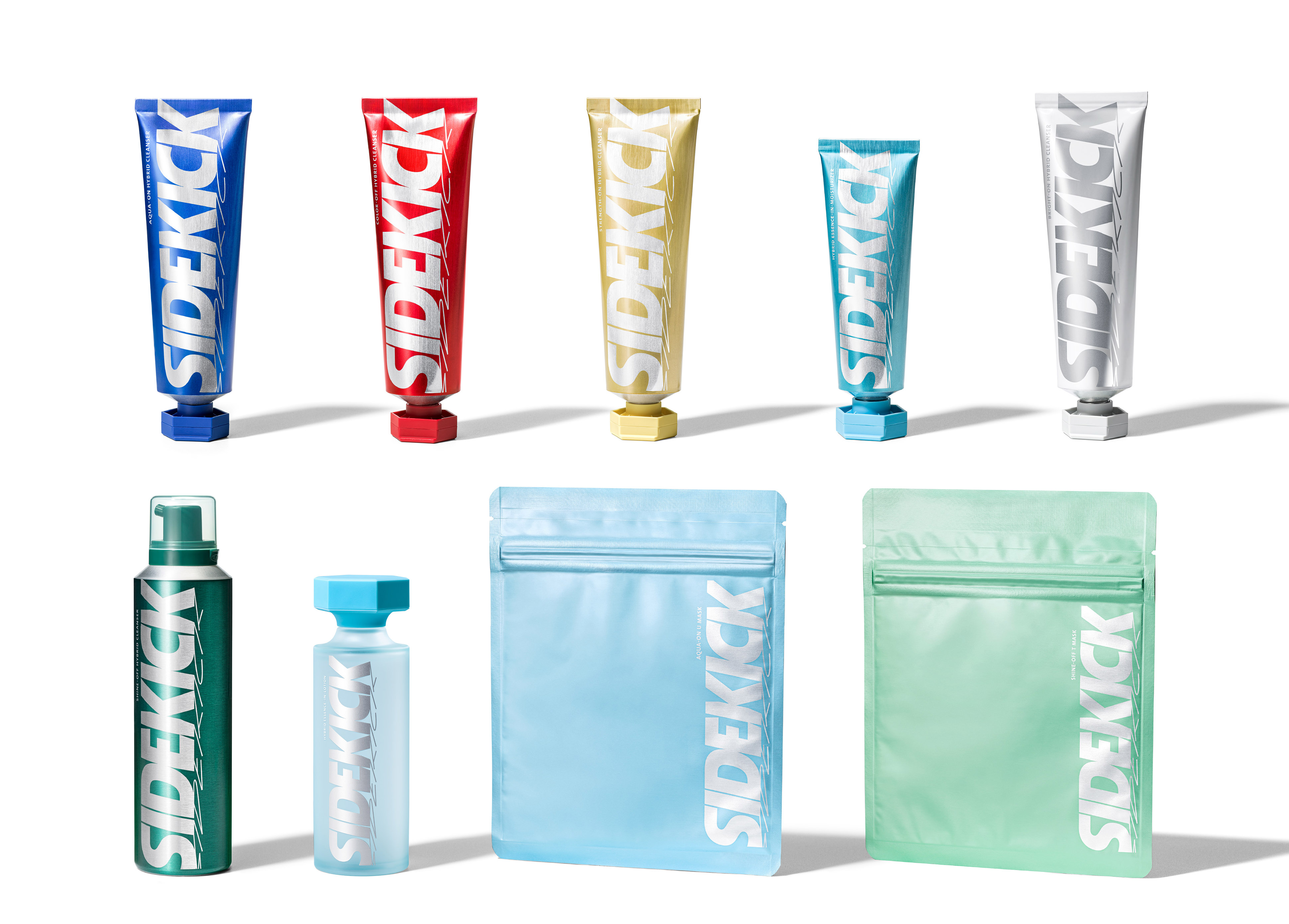
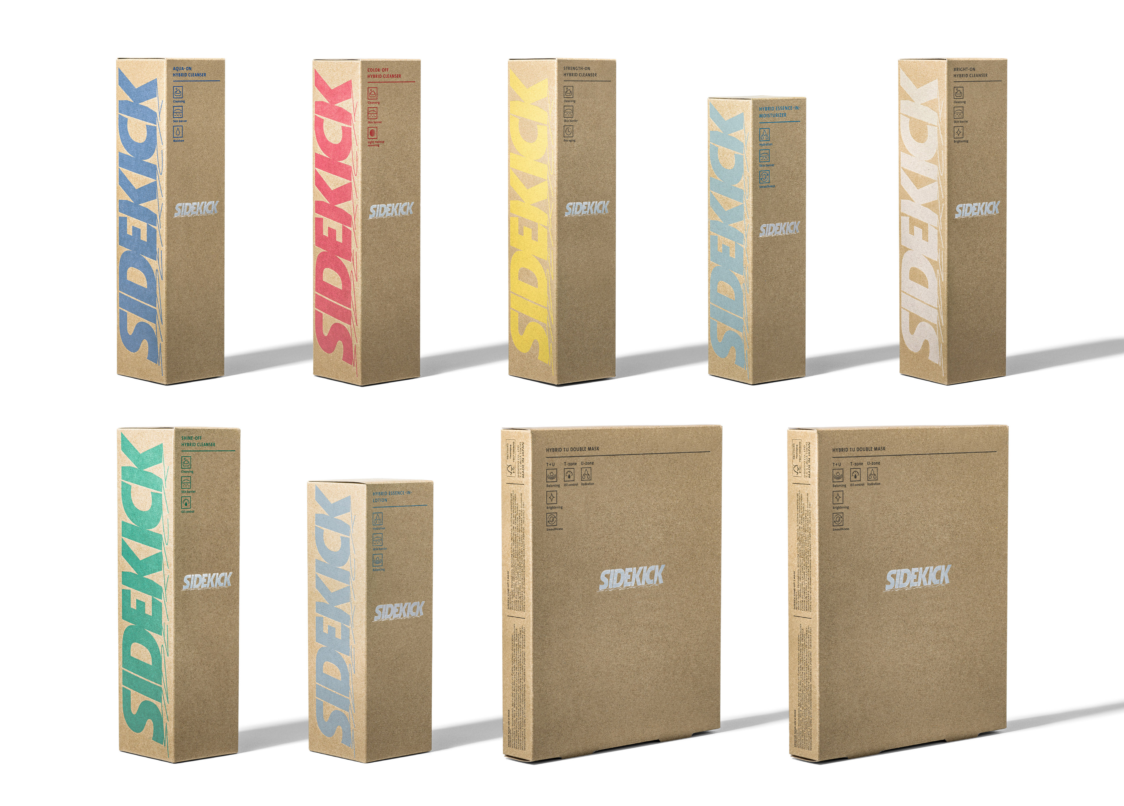
Packaging and logo design for SIDEKICK, a new skincare brand for Asian Gen Z men.
The logo is designed with two types of typography. One is an orthodox logo type, and the other is shaped like a graffiti line.These expresses the characteristics of the GEN-Z generation, which has two sides to it: the face it shows outwardly and the identity it keeps inside. Also the two typographies, like themselves and their shadows, are always inseparable. The inseparable existence of their buddy, or SIDEKICK, is also visually expressed in the shape of the logo.
アジアのZ世代男性向け新スキンケアブランド「SIDEKICK」のパッケージおよびロゴデザイン。
ロゴは、2種類のタイポグラフィーでデザイン。一方はオーソドックスなロゴタイプ、もう一方はグラフィティのラインのような形状。表向きに見せる顔と内に秘めた自分らしさの二面性を持つGEN-Z世代の特徴を表現した。また、その2つのタイポグラフィーは自身とその影のように常に離れることはない。切っても切り離せない存在は、自分の相棒、つまりSIDEKICKであるということをロゴの形状でも視覚的に表現している。
CREDIT
- Creative Director
- Akihiro Yamada [SHISEIDO CREATIVE]
- Art Director
- Yoshiyasu Hiraoka [SHISEIDO CREATIVE]
- Kazushige Takebayashi [SHA inc.]
- Natsuki Isa [SHA inc.]